Well i skimmed through some of the chapters I could and I saw the changes. I love how you improved your pannel layouts and got rid of the black panel for long text. Your speech bubbles did an excellent good job at guiding the readers. These are fundamentals to comics that makes reading more enjoyable.
Now to the art style. Improvement is noticeable at first glance! Better line art, more background, good ones at that! More angles. Your drawing skills improved without losing the charm of stylization and that's good!
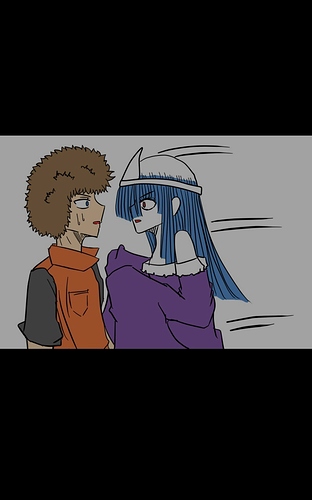
So tbh and this just my personal opinion I enjoyed the messiness and the transparency in coloring of the first edition, they add so much charm to the ghost theme with a muted color scheme the vibe was better I'm my opinion.
I also noticed that at your last chapters you switched to more of a webtoon style witch I appreciated more than the comic one (this I biased bc I prefer webtoon in general) it had a lil flaw though, the pages were too long and too empty so lower the amount of transitions and group dialogues of the same character into a composition.
Your comic is giving me huge "oh my boo" vibes witch a great thing.
I think if study it a little it would benefit you well.
So good luck with your adventure in finding the best ratio to make the best version of your comic!
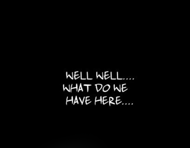
Edit: This is more of a dark scena for more reference
height="500">
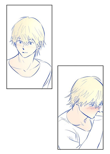
edit: mre pannels