I'll take a gander if you don't mind outside critic.
I took a look at the first/second chapter then a more recent one Ep five
So first, I really love that you seem to be challenging yourself with so much action scenes while telling your story. I can see what you want to do and with more practice, I'm sure you can accomplish a lot!
That being said though, I feel like the art is a bit rushed and gives a bit of a incomplete feeling. The little floating head and white bodies felt out of place. I get they are mobs/not real(?) but I thought maybe adding to it would add to the action scenes (ex. facial expressions and flow of moment with their clothes)
I would also maybe work on your SFX in the actions scenes - other than just writing it down, you can make it bigger, have different style for each have it stand out more etc.
Since Ch5 is more a conversation episode here are some of my thoughts:
Maybe instead of writing the text, you use a font so it's easier to read for readers.
Like in the other chapter, the artwork looks rushed overall. I do like how you did the character's shadow here.
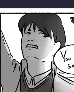
But then in the other panels and characters the shading seems rushed and kinda flat.
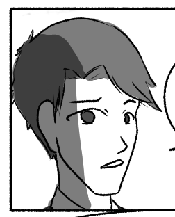
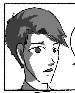
I played around with the char's shadows on the right. It's a bit of a difference. It might take a bit more time but ti's something you might want to work on. Finding out where the shadows goes on your characters (and the facial structure/body overall) is always a good idea.Esp if your shadows are as dark as you have them in this chapter.

