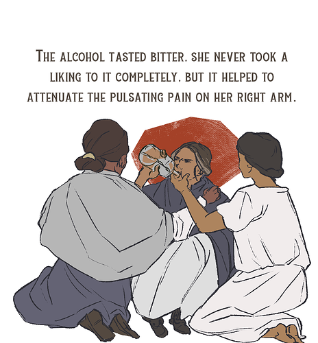
Here we go.
prepare for a bit of a tangent here.
so. composition is a lot about "what is your intention" so a "bad" composition is just one that does not contribute to what you want your art to evoke.
a thought through composition guides the eye, creates focal points and can make things more interesting.
very generalized, you can go two ways: balanced or dynamic.
- balanced is for really calm and serene scenes. the format is usually horizontal
- while dynamic is exciting and has tension. the page format is usually upright.
there's compositional lines in most drawings.. Like a horizon if visible will be one of them. or if you have a figure and they are posed, the way they bend will produce sich lines as well. (I'll show you on your drawing in a sec)
Horizontal and vertical lines are again more static
diagonals more dynamic ...
here's a google image that works pretty well
one isn't worse or better than the other.
the first makes him look dependable, and serious. the second makes him look energetic and "go getter".
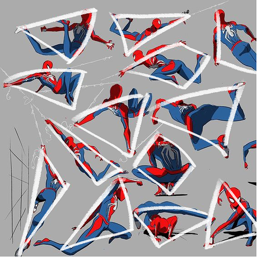
there's also shapes that have those attributes.
basically, the more symmetric the shape, and the more secure it would stand on the ground, the more static it is.
a pyramid? static
an upsode down pyramid? dynamic.
those shapes come into play a lot for poses!
and I have an amazing demonstration for this.
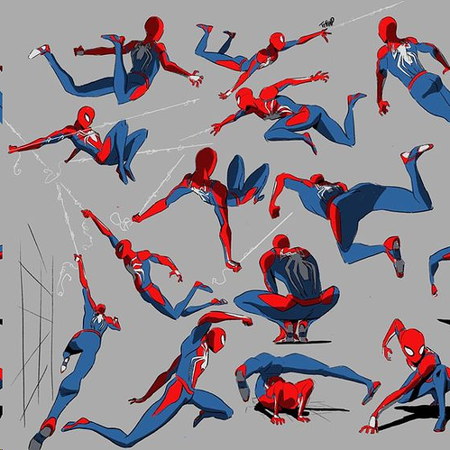
look up any spiderman art that's worth it's salt. youll get something like this:
pretty dynamic, right?
and now look at the shapes. almost all of them are triangles with their tip pointing down.
Okay so. I said that there if a composition is better or worse, depends on what you are going for. and while that is absolutely true,There is still the thing about contrasts.
something I'll get back on with colors as well.
to give an artwork visual appeal, which is usually the goal unless you try to make the image as bland as possible (like a comic panel where someone is sitting in a waiting room and it's literally the most boring place ever and the character is so damn bored out of their mind... perfect time to use all the possible tools to make it as uninteresting as possible)
or to prevent visual overload for the viewer, contrast is the way to go.
so. contrast.
in composition this means.
- scale (tiny human infront of towering monster)
- dynamic ( e.g. a lake scene with everything harmonious, horizon is horizontal, composition is symmetric.. etc.. and then breaking it up by eg putting in a diagonal shore line. or a row of birds in a v formation)
- symmetry (if everything is symmetric, then adding an element that breaks that up)
- density (if there's an accumulation of objects in one place (also goes for patterns) then there should be an erea without)
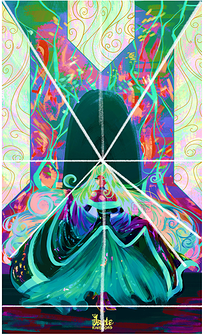
What this means for your artwork specifically
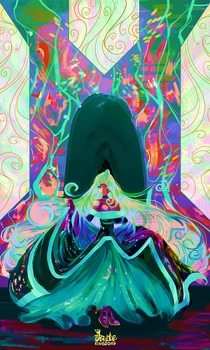
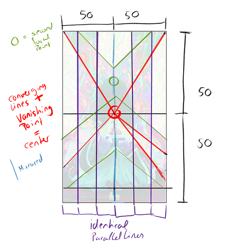
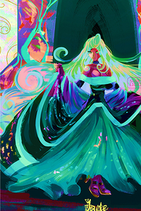
here's a detailed break down of the main lines and proportions of the image.
so. right now the composition is really static. the guiding/diagonal lines converge at the middle, and non of them guide to the important part of the image (which would be the character I assume)
theres identical vertical stripes, a mirror axis in the middle, and the whole image can be split 50 50 both diagonal and horizontally
the vanishing point is dead center, and above the characters head as well
if this was, eg. a mural of a goddess, the background composition would work-ish /even if the additional focal points should also be the vanishing point then or converge at one point in the upper half... and the Goddess would be more in the upper half of the image so the focal points would be on her cheast (as in heart) and head.
the way it is though, puts most weight to the upper half of the image.
the way the elements are placed is also called a stage compostion (dunno if that's the english word).. like when you sit in the theater, and there is the stage, then the character, and then the backdrop. all parallel to each other (deapth wise).
the main element, the character, is also "framed" there's a padding to all it's sides so it won't reach out of the image.
if those are things you don't want.
then there are several compositional choices you can make.
I will tell you my recommendations. non of these are a must, and there's a LOT of ways to go about composing this exact scene.
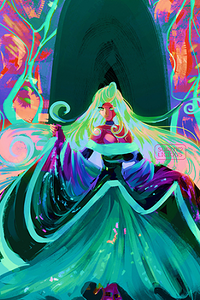
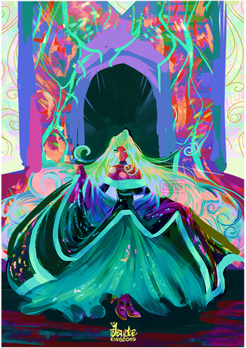
Vigurous cropping.
changing some converging lines to meet at the face, and to make the vertical strips a bit less even
or changing the shape of the dress to make the shape less static... it'll still be a bit bottom heavy, but with a few more diagonals
thats some quick things without changing the image itself that much
if you want to go deeper into composition, I really recommend this video. everything he says is 100% on point!
now I also wanted to talk about colors!
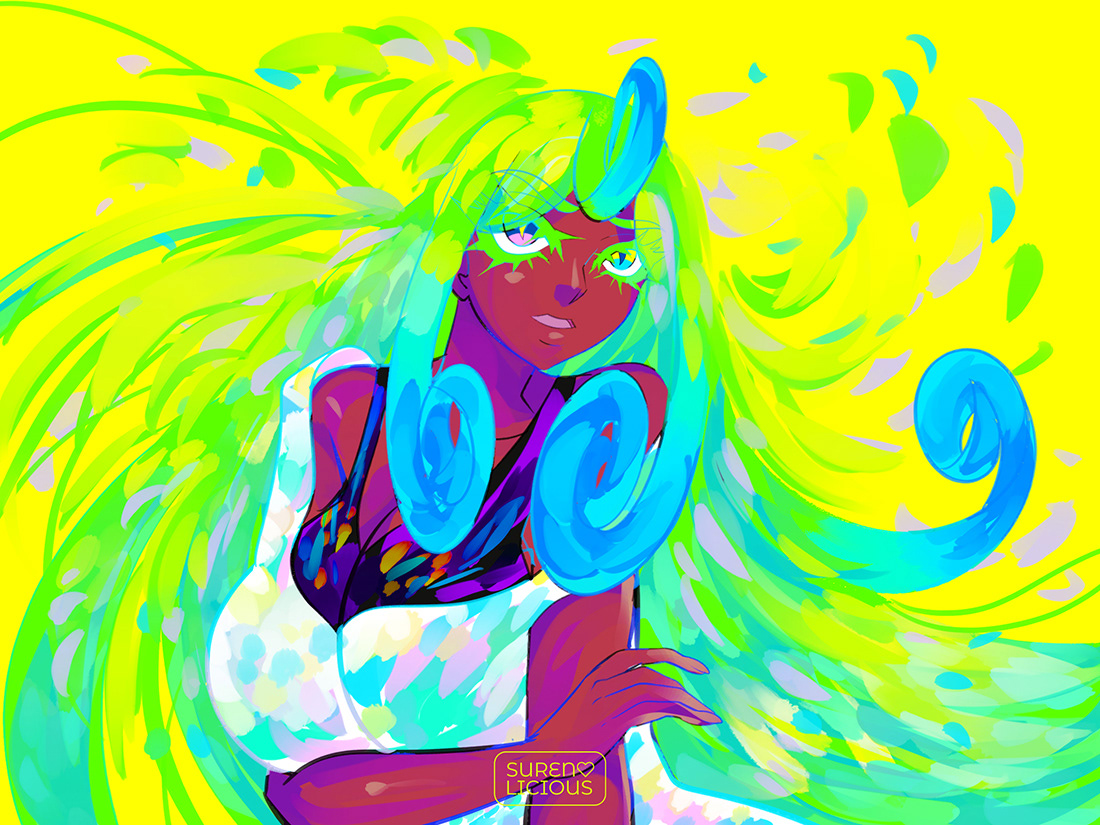
You love maximum saturated colors and it's obviously something that is important for your style, so I won't tell you to desaturate.
why I do want to talk about this at all, I looked at your portfolio, and almost consistently, it is really hard to seperate the different elements of the drawings from each other.
that is partially due to the very even distribution of detail (aka there's no contrast in how texture and patterns are applied. everything is just. textured.) and due to how there is no discernable logic behind your color application.
what I mean by that is, the same colors are in the BG as in your Main element. which, in a drawings thats already really interwoven due to it's patterns, will make it even harder to see whats going on.
the ones on your portfolio where the colors works best, are things like this:
- where you limit the palette... tho that isn't really what I'm getting at
- where you have a warm-cold contrast.
and the contrasts, again, is where it's at. to seperate an object from another, you need contrast. the most obvious one is light and dark... like black and white.
but you can have your image at a consistent brightness and still add contrast (that's what e.g. pastel colored drawings often do)
again, contrast in texture would work really well with your art... like in your request image, ironically enough, the doorway stands out, because it's the only part of the image where it's a bit calmer
she shape of the character also seperates best from the background.
and assigning an object a main temperature.
even if the image is full of patterns and bright colors, if e.g. the background is colored with cool colors, and the character with warm ones, it will also help to seperate them.
I hope that didn't sound like I have a personal thing against really colorful art owo.. I really just point this out for the purpose of untangling elements from each other a bit
anywho. I hope it helps.. even if it was a lot!