another difficult one ahhh
generally, everything is on a solid level!, the backgrounds, the character designs, Expressions and Poses, Colors, textures/patterns.
So I won't be focusing too much on one thing, but more of an overall "how to polish it" to maybe just elevate it overall?
be warned though, since you are already being really stylized, Some of it might just be my personal preference? I try to be aware of it and say so, when it's less objective, but some might slip me.
I also hope it won't be too overwhelming when I go into several different things.
Since we talked in another thread about this already, let's start with text!
I think your font is pretty good! it's readable and fits your style,
in big blocks, it gets a bit harder though. maybe you can experiment with size, thickness and line spacing.
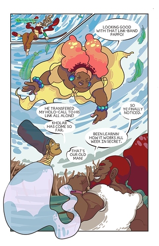
also be aware of the padding/the space between the text and the bubble border. (like with "he transfered my holo call to his)
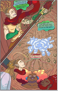
the Text quantity sometimes get a bit overwhelming, like in the introduction scene for the Purple character, where the left page was just (expository) text basically, which also overlapped the background a lot.. which isn't bad per se, but In Establishing shots, it can be a bit of a pity.
like in this shot!
It's a really cool shot of them flying while also establishing the Institute!
and shots like that absolutely deserve to stand for themselves.
the one text bubble with "ready to make your dynamic entry" would be enough to get the characters acting instead of being props for the shot (which I personally don't mind either, esp if the character reactis to the establishing shot), without overshadowing it with a whole dialogue that need's the readers attention!
It might also be a good idea to change the font for the narration and drastically different speakers like the radio.
I've scavanged a lot on scanlation forums for type setting for comics, and that seems to be a standard, to distinguish Dialogue from Not-Dialogue
generally, it's a bit difficult to find much about typesetting in comics, but Scanlation sites are a really good source. since they focus on translating comics and manga, and thus really have some street cred and experience in that field.
there's more, but I found those helpful
this one is really short and a quick read
this one goes pretty in depth
https://www.insidescanlation.com/etc/vorbis-typesetting-guide/fonts
(the site layout sucks since they jst exported their word file and there's no menue to get back to the main site, which is https://www.insidescanlation.com/ )
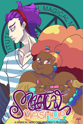
before I move on to the next part, again about readability, but this time concerning your title, it took me a while to understand that it said "magical".
maybe it'd be worth it to try for something clearer.
Handlettering is cool tho, so idk, maybe you could incorporate how her Magic is drawn or something, to draw a connection to it?
onwards to Characters:
the shading of your characters is really good, only in two instances I have questions.. since it could be intentional, which would be valid.
the Main character's shading, I don't quite get, why she is shaded with such a cool/blueish tone when her skin's undertone is more on the warm/neutral side, and the rest of her design, esp the hair, is really warm and warmly shaded as well.
it could pass as an effect of athmospheric lighting, but when she's around other characters, its obvious that it's just her.
so yea, this one is a personal nitpick. Esp if you chose to do this interntionally, don't mind me :')
the other instance is where the shading style doesn't quite work wih skin.
I think it's awesome that you use with flats, and how you do the brushstrokes!
it's really unique, and it works really well on hair, fabric envoirements etc.
in his shower scene tho, it looked a bit too much like dents, since the shape was really .. dent-shaped.
it's not a big thing tho.
__
something else regarding your characters is that some angles of their faces just don't work.
youre definitely practiced in drawing faces, but your low angle shots aren't on the same level as the rest of your work.
the faces get a bit too flat. and the proportions are off. Keep in mind that a head is rather boxy, so the face, the sides/cheeks etc will all be affected by the perspective just like a box would.

to really get something accurate-ish, there's really helpful tools like this one
http://referenceangle.com
and if you look for head reference 3d, you can find more posable models with even light direction
https://www.artstation.com/artwork/GX3Ax1
or just .. pinterest and looking up "low angle head reference" or sth.
I'm bringin this up, since there were several character shots with the same issue, but only when it's low angle shots.
The last thing I found that could elevate your art is about the shading.
I'm not taking back that your shading style is really cool and original. I totally don't think you should change it.
the only thing that might improve it, is if there was more system to it when it comes to backgrounds and depth.
To convey distance in drawings theres several combinable ways, I'm sure you're familiar with, since you use some of them but just so we're on the same page
What your shading could really help well with, is creating additional depth .
your shading give's texture/patterns/detail to the object.
so if you can organize it, you could make the foreground shaded, while the background becomes increasingly flatter the further youre away. and thus lowering level of detail and contrast.
esp for pages like these!
I hope it was okay that I talked about a lot of rather general things, instead of the example pages in specific owo. like I said, your comic is already really good so (except maybe the low angle faces) most of the things I talked about are more on a micro scale and don't really have that much impact on the comic overall.
hope it still helps!