Comic: Arbiter's Wake
The Compliments:
Your pacing and delivery are solid start to finish. I didn't feel like anything was dragging or overly rushed, and what little characterization we've gotten so far has a lot of charm to it. The 'soldiers raid an innocent village' thing is a very standard and tired trope in fantasy, but it's usually a lot of implied off-screen killing while the survivor runs away: I applaud you for having the balls to show us dead children and a merciless decapitation. You didn't gloss over how traumatizing such an event actually would be, which is really common with these sorts of moments in fantasy stories, and it helps sell the impact you need to kick off a story like this. I'll discuss the art more in the criticisms section, but there were definitely a couple of standout moments. You definitely have chops as a visual storyteller.
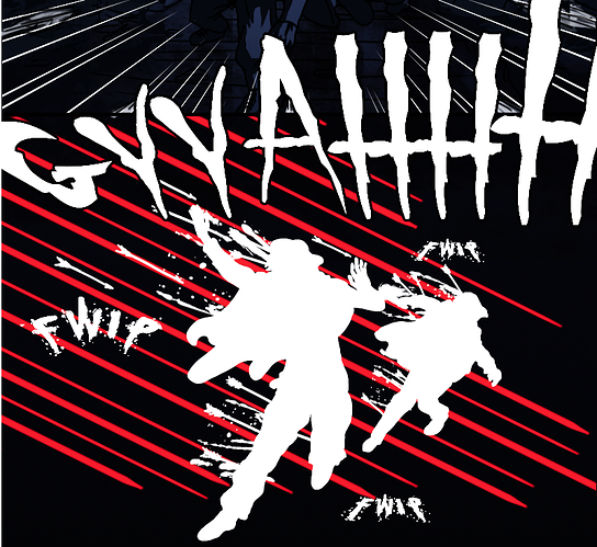
The use of the white silhouettes and red lines really makes this panel stand out, and drives home what an unexpected moment it is for the people getting attacked. Great use of space and framing here to amplify the emotion of the scene.
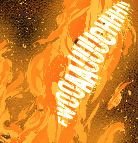
This one's less technical and more 'ooooh pretty fire'. The shape and texture of the flames just looks sick, and I appreciate it.
The Criticism:
Your art, overall, is just serviceable. There's nothing particularly stand-out 'oof that's a problem' bad, but nothing in it wows me either. A majority of the issues seem more like experience things to me: I don't know how long you've been an artist, but the visuals of the comic strike me as someone still learning the ropes of digital illustration.
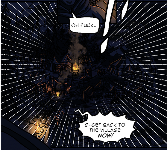
One big thing I noticed is your use of static line weight:
In this image, basically every line is the same thickness as every other line, and maintains that thickness consistently across its length. This is not in and of itself a bad thing, but it does need to be done with intentionality. I'd suggest looking at comics like The Adventures of Tintin to see how a style like this can be used effectively. It requires a lot more focus on where you do and don't place each individual line, as opposed to other styles which can use strong line weight variation to help improve clarity.
It does, however, cause a few very specific problems. I definitely appreciate that you made Keyary actually look frail and sickly (too often the 'frail sick girl in the humble fantasy village' is actually just kind of skinny but still extremely pretty), but with the thick, chunky lines you've used, it makes it difficult to tell if she's sick and emaciated, or just old. I legit couldn't tell what age she's supposed to be in most shots. Making the lines on her cheekbones and under her eyes using a thinner pen would help prevent them from being so extremely prominent. Right now it's a tossup between whether they're wrinkled from age, or sallowed from illness.
Other spots where this would help would be in folds of cloth and texture in hair: making lines much thinner and fainter will make them look like textural marks or faint variations, while thicker and bolder ones are more easily read as the divisions between separate objects.
For the most part, your color palettes are good, and especially in episode 3 where the palette steadily transitions into red and orange as the dragon's presence becomes more prominent the colors are working really well to enhance your visuals, but this:
stood out to me as just overall being too dark and difficult to read. Especially with the white focus lines being such a strong contrast against the
extremely dark blue, it makes it hard to figure out precisely what I'm looking at. I feel like maybe a 10% increase in value on the blues would make this way more readable without sacrificing the 'dark of night' feel. Just a little bit of clarity lost due to color palettes here and there.
The Overall:
I subscribed, so generally positive. I am interested in the story (right now it feels like a lot of standard fantasy tropes with a little more of a dark edge to them, but I see a lot of potential for the story to do unique and interesting things). The art is, as I said, serviceable. Right now I won't be reading this comic for the visuals, but I'm also not immediately turned away by them, which is more than I can say for a number of otherwise-intriguing stories I've found on this site.
Definitely a lot of small technical kinks to work out, but you have a very solid grasp of the fundamentals. Your paneling and storytelling are clear and effective and I didn't feel lost or confused at any point, again not something I can say for even some of the best-drawn comics out there. Very excited to see your progress and how you grow as a draftsman from here on, because you have a rock solid foundation to start from.