Sorry if this feels a bit redundant! I've never critiqued before, and so much of what i would critique in chapter 1 i already see you taking strides in improvement so I’m not sure if I’ll be as helpful as you were for me as you seem to already be aware of everything i spotted, just working on improving it.
Positives:
Your backgrounds are fantastic, especially the forests—they feel full of life and character. Little details like the clutter behind the shed on C3Pg7Pa1 add personality to the scene. The layers of trees, bushes, and boulders create such depth in your forest backgrounds; they feel lush and real.
I also love Victoria and her family—they have that warm, welcoming vibe. The moment when Victoria runs back to hug her mom because it was the ‘something she forgot’ immediately had her worming her way into my heart.
Your pacing is spot on too; each page adds something new without overwhelming me. It’s a tight, well-balanced story, with just the right mix of homey moments vs the more dramatic fantasy ones.
Neutral ### On the Speech Balloons:
Earlier, you used quotation-mark’s and a white box with no tails, which gave the dialogue a more passive voice, like I was reading in 3rd person, which also gave it a more fairytale-book feel. Either way it gave a more distant narrator vibe that felt less connected to the characters. however the later character-tail balloons make the voice feel more intimate and personal, they are now talking in 1st person, in the moment. I don’t know if the balloons with a tail are here to stay or if it’s a temporary thing due to the multiple characters in later chapters. it’s just a stylistic shift I’ve noticed, and I wanted to mention how it changes the experience for me.
Areas for Growth:
Moving on to the critique a lot of it is basically going to boil down to is the ways you could push your artwork to make it more visually dynamic soo I might sound a bit like a Bit of a broken record.
Shot Variety: Most of your shots are either medium or wide shots, with characters shown either waist-up or full body with a straight-on perspective. probably a dozen of your panels have been medium close ups but haven’t really seen close up or extreme close ups
Foreground ElementsLeading on from that, lot’s of your drawings consist of middle ground elements (your characters) and background elements (the environment) you don't really add foreground elements. Adding such would help with giving your panels mote depth and visual intrigue, foreground elements are also a great way to double frame your subject, drawing the reader in more. Here's an example of what I mean :
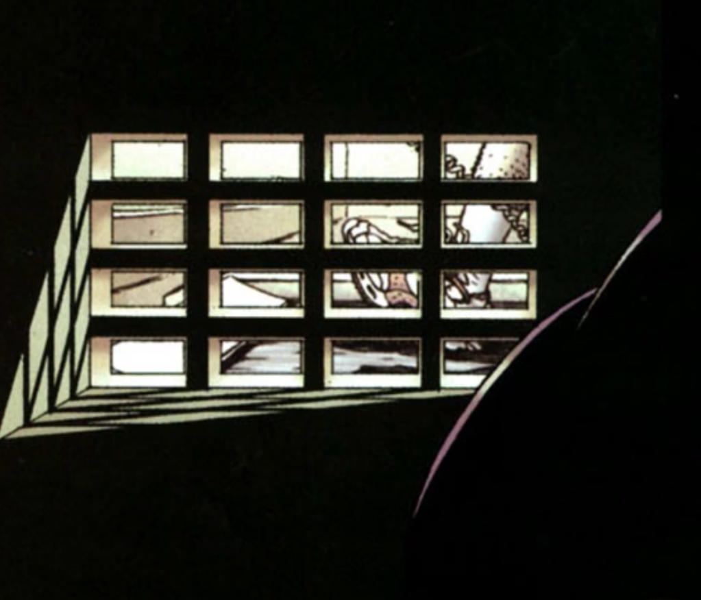
you have the foreground object, the creature, then the middle ground, the crate, and the background, the person running on the treadmill. It helps carry your eye through the panel and asks more of the reader, getting them more engaged and less likely to skip past.
-
Visual Consistency: this leads into the discussion of visual consistency While consistency helps make big moments feel more impactful, too much of it can cause the reader to disengage. You’re art is beautiful but the similar paneling shots can make reading the art become passive —like skimming over a stop sign or bathroom sign, you take it in without really reading it due to habbit. Adding more variety in shot composition, can bring the reader back in- especially during a binge-read.
I’ve seen improvements in later chapters—like in C3P7P1, C3P9P3, and C3P12P2—where the fore, middle, and background interplay is strong.
Facial Expressions:
same with the facial expressions, your characters expression tend to stop halfway. For me when i look at them they’re smiling but they never Grin, they’re upset but never angry or furious.
For example, in C3P17P2, where Victoria is angry and defensive over her new friend, personally her face screamed more mildly upset than angry or overly protective, pushing the eyebrows down more could have really intensified the emotion.
All of these are side notes on how to get that extra punch of salt from your panels, like adding the final highlights to a piece. The only thing I think really needs working on is your poses. You have great portion control and character consistency however a lot of you’r poses specifically regarding the torso can be stiff. Your figure's torso doesn't hunch, bend or twist, even when leaning over. Try loosening up your poses and add more movement to the torso. When reaching for something we move/bend our arms, torso, then legs. (though when running in fear your legs can take off before your brains even processed the threat)
A Side Note on Shadows:
If you're leaning towards painting, consider letting shadows blend into one another when connecting 2 different objects and use them to better define the form of objects. Shadows can become a distinct part of the art rather than just a flat overlay. Frank Frazetta is a great example of this technique(you might have already heard of him as he's pretty well-known); his work uses shadows to create depth and focus. His style might be especially helpful if you’re interested in adding color to your shadows. While some of his art can be revealing when it comes to the human form (fair warning), it’s worth checking out if you want to explore shadows and form more deeply. Here’s a safe piece to start with, and I’ve included a link to a website featuring his work if your further interested

I’m constantly trying to improve in these areas as-well, so i know i’m no expert. But Hopefully you find this helpful.