@miss.monocle OK! So here's my review for Murphy's Law.
First off, 10 things I really liked about it
-The dialogue has a natural feel to it. I like that they feel human--well they're mutants--but they talk like how people talk. Helps me get drawn into the world.
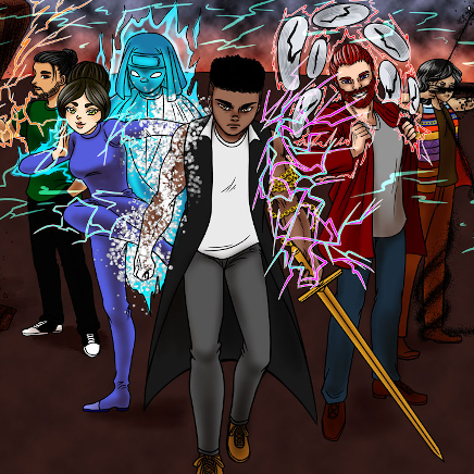
-The characters have distinct and fun personalities. Kit is a loveable asshole who pairs well with Nikolai who's a lot kinder. No one feels like a non-character.
-I like that you put a lot of effort into the backgrounds. As you improved, the backgrounds improved, and it helped create a sense of space and did a lot of good worldbuilding. It had a lot of atmosphere in that way, too, because of the weather and lighting in the scenes.
-I enjoy sci fi quite a bit, was a sucker for X-men, so I enjoy this concept. Everyone has a cool unique power. Everyone has their own agenda. While it's still early in the story, there's plenty of possibilities that could occur, and you foreshadow things that could happen--like Kit running out of time and their friend who has just...a lot of anger issues. It gives incentive to keep reading
-I like how you introduce lore, slowly, as if the characters already know it and so don't need to explain to eachother, but in a way that we can still learn about their world as a reader. It had a nice natural flow in that way.
-It starts with action and continues to have interesting action in each episode. A lot of action comics don't have that.
-I like that you're playing with your panels--trying out interesting layouts and things like that. I get bored of squares. I like seeing diagonals. Diagonal panels have a lot of action to them.
-You take advantage of digital and do some clever tricks to show mutant abilities happening, like her squares and moving around the RGB layers to make a 3-d effect.
-It has color without being garish.
-You move your characters around so we're not always seeing them in one pose or from one angle. Helps them feel more alive and adds more dynamics to scenes.
5 things that made me stumble
-Changing character designs-- This is in part because you're rapidly getting better at art as you're drawing this, and Episode 3 and 4 are older than the rest, but the characters look very different as time progresses. It meant I didn't know who they were when they were reintroduced. Some characters look pretty similar too, Nikolai and Birb were easy to mix up, so it was good that Nikolai had a hat in the scene they were both in. Creature also looks a lot like Nikolai, but that was episode 3 which sounds like is your oldest drawn episode.
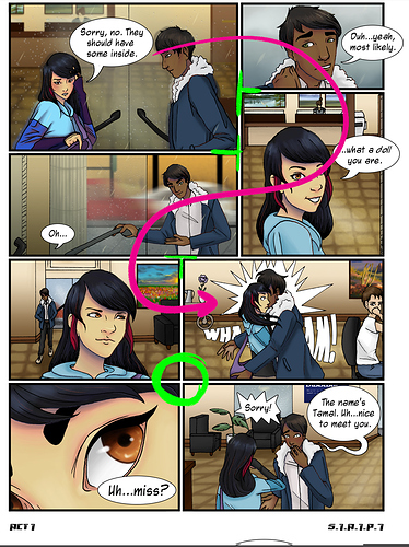
-mixing up panel and bubble order--There is a few places I read bubbles and panels out of order because the order was unclear or because it wasn't in the path my eye was naturally following. We have a lot of readers on Tapas who only read Manga as well, and Manga reads following the panel border, rather than strictly reading in one direction.
So I read like this:
And in green I'm gonna indicate the border that people look for when reading manga. It would take you on a different route than the one I took, but still the incorrect route.
While it's pretty normal in Western comics to have a cross like in this green circle, you want to avoid that on Tapas, because Manga readers don't like it. There's no clear direction of where to go.
-Along with bubble order, sometimes I just didn't know who was talking. If the bubble doesn't have a tail to indicate who is speaking, you may want to color code characters with an offwhite or find some way to place the panels so the tail can still exist.
-Sometimes I couldn't tell what people were reacting to in the scene. Especially wen it comes to Kit's time-travel teleportation, which is a shame because she has a pretty cool power. So in a scene like this it took me a bit to figure it out.
Since it's a comic and not animated, I was using my logic to assume she walked behind Birb normally, so I was like "why is she squatting next to Birb?" And it was only on the second read through I noticed the dark blue squares, which are very close to black, and realized she had done her time-travel teleportation and that these three frames were instantaneous. Maybe if there were scenes that showed that action as it was happening, rather than just a before and after?
-It does feel a bit cramped in places--The bubbles are really fit in there close, and there's a quite few pages that I think would be better to be 2 pages than 1. And because the dialogue is done this way, it makes it feel like the characters don't have time to react to their conversations. We don't get as much characterization as we do in places that have more space for things to occur more naturally. So the scene in the park is more successful for me than in places that had a lot more cramped panels.
Also, and this is a typography stickler thing--you want to avoid changing your font size. That's not an absolute rule or anything, but it looks like the font size changes so you can fit more font in, rather than to emphasize speech.
Going along with this, most readers on Tapas read on Mobile for some crazy reason, so your phone readers will nope out of anything with many panels and lots of text, so it's better to err on the side of less is more when it comes to number of panels on a page. How many per page is always up to you, but the amount of space in episodes 3 and 4 (which again, are your oldest episodes) is what I think hurt them most.
Overall--I liked it! I wish you luck in your scenes to come!