@madocallie
Hello, I'm back with a more analytical review of your comic! Sorry that this is a massive wall of text, but I tend to go into intense detail when I write reviews!
STORY
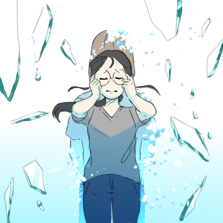
Reading it the first time, my initial thoughts were that this was an interesting subject that not a lot of people write about and that it has a very cute art style. Your character is adorable and her facial expressions are very readable. The dialogue is simple yet packs a punch as it gets to the point very quickly and effectively. I immediately understood what was happening without needing to re-read anything to check if I missed any crucial details. Your exposition was short and sweet and gave all the information the reader needed in order to understand what was going on at the current moment, which is perfect! I think that your general pacing & choice of words for the dialogue + exposition was really good and kept the reader engaged by having a very natural flow.
ART
I was honestly surprised with such a cute, simplified style for the art since this story seems to deal with more serious subjects (other than just a deep dive into the Therne). However, despite the art style and the subject of the comic differentiating from one another, I think it fits pretty well and actually complements the other fantastically. The character design of Poppy is very cute and immediately likable, she's very expressive, and you can immediately tell how she's feeling without needing to read too much into the dialogue. Great job on her character! The choices of color were also very nice, and I loved the change in hue as Poppy dove deeper into the Therne, indicating that it was getting darker, along with the mood of the story. I also really liked the flowing background (in chapter 1) of "diving" deeper into the Therne with the panels laid on top. I think that was a very clever way of getting the reader to really feel and see what Poppy was experiencing. Also, I noticed it was called out before that the line-art seemed very pixelated, but I actually don't have a problem with that as long as everything else in the story has that same pixelated feel.
However, I think that what could be improved upon is the consistency of the art. From my immediate first impression, it was that some of the background objects of both chapters seemed slightly inconsistent in how it was presented. Immediately, I noticed that some things were very clearly hand-drawn while others looked like edited images with some slight coloration/line-art alterations put into the panels. For example, it seemed that the "creature you'd hardly call 'fish'" did not match the current art style and was ambiguous as to what exactly it was. I understand that the point was to probably indicate that this was what you'd find in a textbook and it was not supposed to look like a fish, but it was so far from what the established art style already was, it immediately stood out and pulled me out of the story. I believe the same goes for the exterior shots of the submarine that Poppy is in. The line-art was just not consistent since it became much thinner and detailed compared to everything else that was shown. There also seems to be a slight difference in the thickness of the lines for your line-art from panel to panel—as if Poppy & the speaker were drawn differently than the rest of the background material. It's only a slight difference and took me a couple of read-throughs to catch, so it wasn't that big of a deal. If what you're going for is that "collage" style of inserting real images throughout your comic (similar to how Annarasumanara does it, I would recommend including more realistic images to fit that style. There is consistency if nothing is consistent, you know?
**This also may just be me being super nitpicky but I noticed that Poppy's profile view of her face didn't seem to exactly match her face from the front view. It seems that her chin is much further back and her nose is higher and sticks outward farther than I expected in her side profile view. This could totally be a stylistic choice, so take this nitpicky stuff with a grain of salt!
IN CONCLUSION
I think that what you have here is really good! The story is captivating and Poppy's personality and relationship with (I'm assuming) her coworkers is an interesting dynamic for her situation. My only criticisms for improvement would be to keep the art style more consistent with the simplified art style that you already have going on. I know it's too late to change designs, but I think what would have helped would have been to simplify the "realistic" design of the current submarine and change it into something cute and simplified like how you did Poppy or the control panel room of the sub. That would have kept the art style in that similar yet cute and captivating style that you already have going on!
I also noticed earlier that you had problems with getting the tiny errors out of the panels (like the tiny white dots) with, I'm assuming the paint bucket, when you're coloring things. That's all technical stuff and easy fixes for that is to either edit the settings on the paint bucket to paint 3-5 pixels past the area that you want to paint or to expand your canvas and then shrink it when you finalize/upload it. What I like to do is to work on a canvas that's double the size of what I'm planning to upload it at. That way, I can size down rather than size up on the canvas so in my final product, my art ends up losing/hiding all those tiny details and they're not as noticeable anymore. It's always better to size down than size up when creating art digitally!