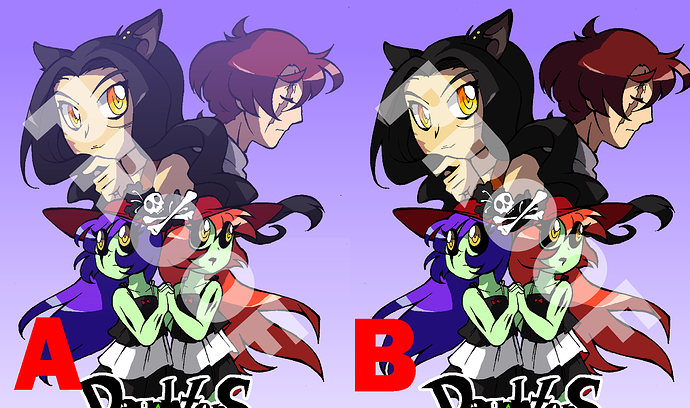
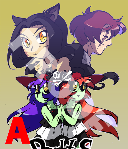
So I need to finalize this tonight, and I'm not sure which version to pick...or if I should do something else entirely?
One the one hand, we have the version with the fancy blend mode layers on top (oooo, depth fogging~) and on the other hand, we have the naked version that basically just has the original drawing over a gradient...but it still looks very nice, and somehow...cleaner. I dunno X[
I think my biggest issue is a sort of "clash" of contrast techniques, if that makes sense?
Like, I already made the background characters distinct from the foreground by making their shading more dramatic, and so then putting them in purple on top of that looks...off, somehow.
Or maybe it's just that I'm doing depth fogging wrong, and it wouldn't look off if I changed a color or fixed something? It's hard to decide when I'm experimenting like this...