Okay! So the first improvement that is relatively simple and I think will bring up the quality a lot is increasing the font size. It was readable on my computer, but not on my phone.
Also, make sure to proofread your text! Grammar and spelling is an exceptionally important thing in a comic, if I have even one typo in a panel my editor will make me correct it and reformat THE ENTIRE CHAPTER (even if I have it already saved to the final flattened versions) - Always double and triple check!
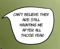
For example, this should be "I can't believe they are still haunting me after all these years"
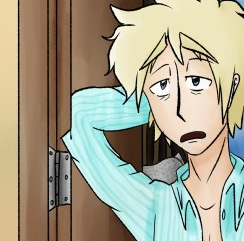
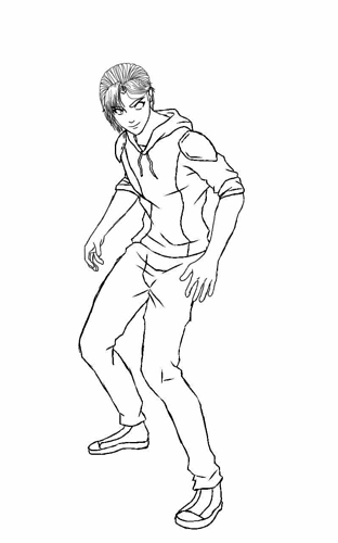
Make sure to also double-check the artwork for errors. The elbow here is cut off.
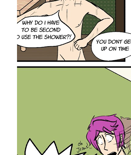
Here's some more errors where the bubbles/lettering is cut off. You honestly have decent art and can put things in settings coherently, I know what was going on in the first chapter pretty well, but these small errors like typos, line problems, etc can drag down comics that would be like a 9/10 to a 4/10. Make sure to be super neat!
The sudden transition to black and white with tones is a problem, but I'm sure you're well aware of that so I won't go on about it! Consistency is important for a reader to feel like the story is flowing well. I actually can't really comment on the story after this part because the transition was so jarring and confusing that I couldn't understand the panels at all.
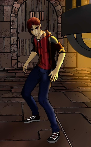
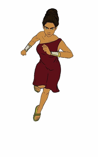
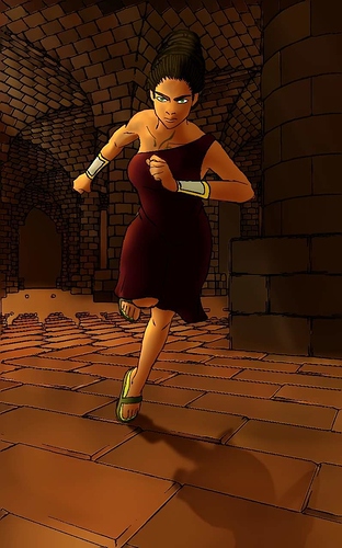
Going onto your most recent chapters, in general study what I've recommended prior multiple times: Anatomy, color theory, but additionally perspective since you do seem to like to do shots where their bodies are at angles (which is good to do, definitely would be expected out of a featured artist) - You can try many online sources for figure drawing such as this and just practice once a day for at least 10 minutes. You'll need to do it daily for basically, ever, but expect results in about a year. As for color theory, here's an entire pinterest with tons of tutorials. Read them all!