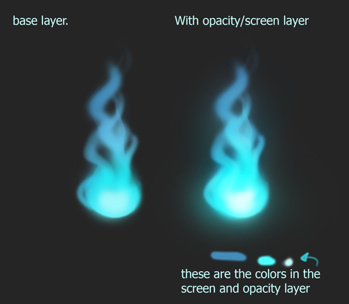
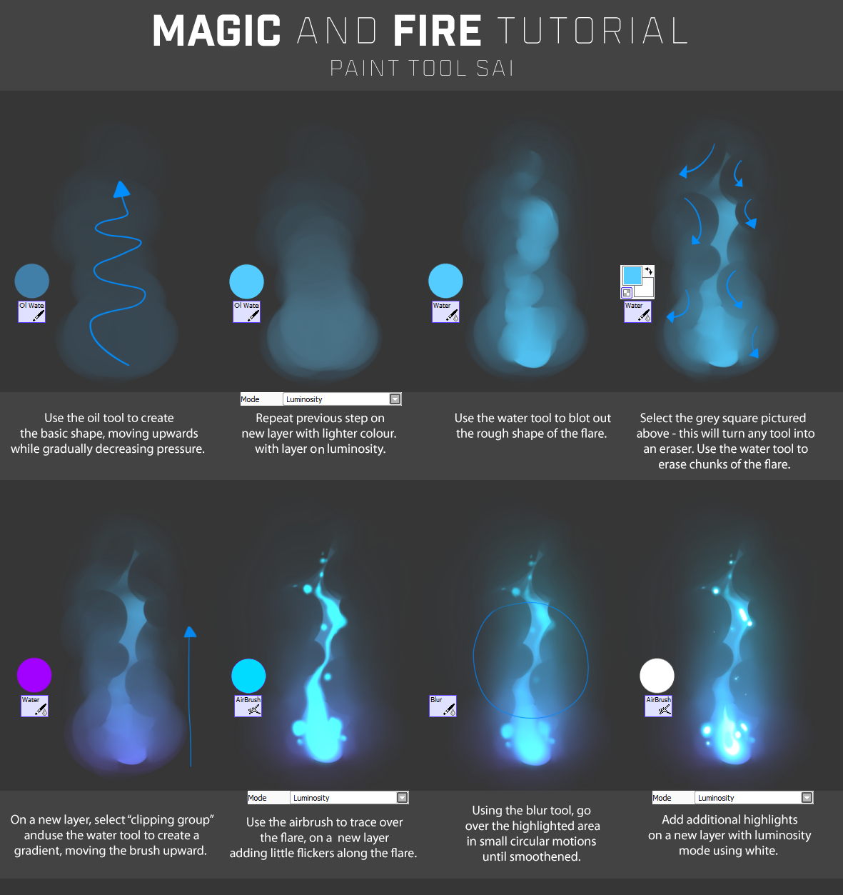
I try to keep smudge use to a minimum and only at the tips or places the wind is blowing through. It's working on this picture, but should you change the background or make it move and it starts feeling unrealistic and more like colored smoke.
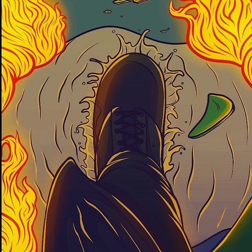
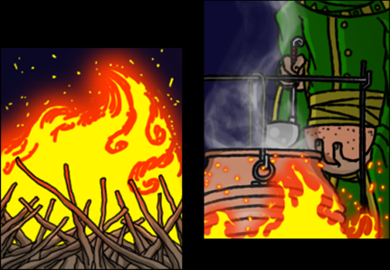
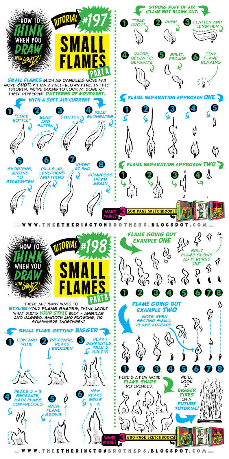
For me, the shape is key, so making something really swooshy and dynamic, and going from the most proeminent color of the flame to the lightest and making sure it's not just the same color in different levels - regular fire is dark red(but don't overuse it), to vermillion, to orange, to yellow, then white and some fire sources will also have some blue to represent hotter fire.
While looking at photos is a good reference as usual, with fire you also need to study other artists' pictures because the real thing doesn't "look" real, to put it on few terms. Tons of people use textured brushes to imitate cinders, or use glow set to Hard Light behind the fire to show how warm and vibrant it is, and many other techniques.