Ooooh boy, my process...
So I start out with a script. I treat my script more like a guideline because what works well in written and drawn storytelling aren't always the same, but generally the events all happen and key lines are more or less the same, and the script helps me check the tone and pace.
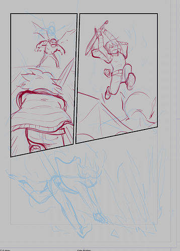
Then I thumbnail. My thumbs are hilariously messy because fortunately only I need to actually use them.
I make my pages mostly in Clip Studio. The panelling tool is awesome and I've been inking and panelling in Clip Studio for probably ten years now since it was Manga Studio 3. The fact that the new version is also good for colouring is great and really streamlines my process! I use a single panel "1-koma" layout and the panel cutter tool to set up my layouts. I always set my BG colour to light grey because it's easier on the eyes for pencilling than white.
I start out roughing in the figures, going for a general feel of the poses and expressions and things like arc and weight of movement. I'll often do multiple passes of pencils, each getting a little more tight...
Around the second or third pass I flip my drawing and use transform tools or redraw bits because my drawings naturally tend to skew or lean to the right. Helps me fix things like misaligned eyes, people leaning weirdly etc.
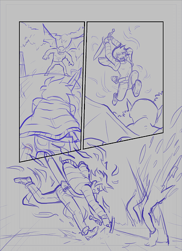
When I'm inking, I don't treat my pencils as set in stone. I often add detail here, or fix issues that become more obvious with the tighter, more high contrast look for the inks.
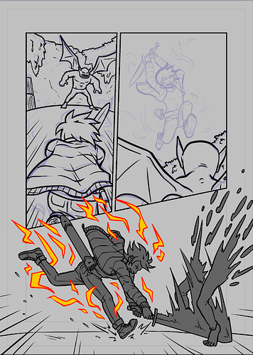
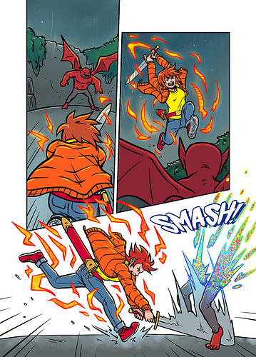
I block in all my foreground elements, usually characters and major props in a dark grey fill (or a bright colour for magic effects) and transparency lock it. Particularly helpful on a page like this where one panel has content that overlaps other panels!
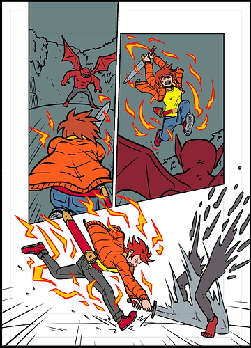
Then I flat all the colours........this bit is boring hahaha. I have a set palette of colours that I add to when needed or use overlays if I need a very distinctly darker tone.
Finally I paint in the background with textured or pattern brushes, add edge highlights to the characters in a "glow" mode layer transparency masked to the flats (The colour of edge highlight allows for a surprising level of control over the tone and feel of a panel) and add glows to any magical stuff going on.
I export to Photoshop to letter and do my speech bubbles (basic shapes made with the shape tool in a folder with a stroke effect on it, boom, simple!) and get something like...
And that's how I make a page of...