Oh my, I was instantly taken aback by how beautiful the cover art is!
Your comic has easy-to-read, organised panels with very consistent reading direction. The constant shift in camera angles also made the idle conversation scenes interesting. Good job! 
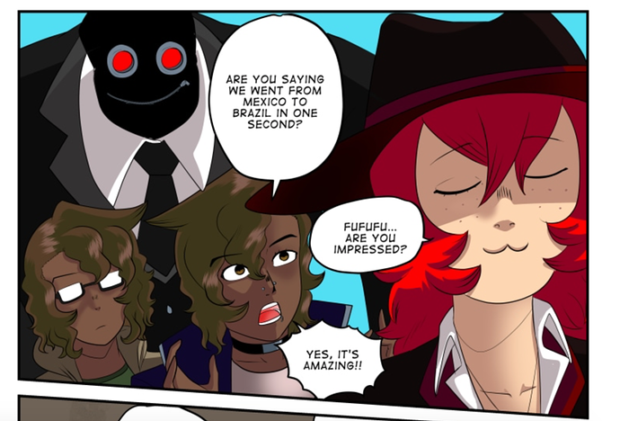
I wish the size of the text was a little bigger, though. Maybe it's because of the size of the panels, but I think mobile phone readers will have difficulty reading the smaller letters. (I think the text size in this panel is just right):
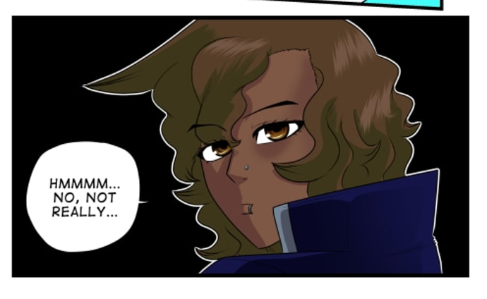
Also, since the characters wear a lot of darker colours, I think outlining them with white will help distinguish one character from the other. (Like this panel here):
Hope that helped!