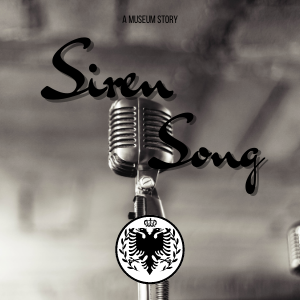
I kinda like it but my eye keeps getting drawn to the negative space trying to figure out what's there. I agree with a couple other people about the lettering (love the font) across the microphone being hard to read because of the darkness. (font for me is fine )
Also... and this is nitpicky so throw it out if you want to.. on the right there's that little lump of ... another mic? Any way to get rid of that? I didn't see it at first glance but the more I study the picture the more I see it.
Ooooooffff. I know how hard it is to put these things together and then have people make all kinds of suggestions. Just know that my first impression was... oh I like that. So overall the "impact" part is there.
A thought, which goes with other folks.. The title above the mic because then you can really see the mic and it ties in with the title. Which I'm sure someone else has mentioned... more coffee, half cup is not enough.