so a few tid bits, mostly technical:
- id recommend making your pages bigger - the limit is a 940px width. i think on webtoons its 900px, so thats a nice convenient width. that gives you more space to play with, and assures that your image fills the page for all readers.
- get chaself some custom fonts. no more times new roman, no more comic sans. these fonts arent appropriate for comics, and having your own specially selected fonts gives things a bit of stylistic unity and makes it feel more professional. theres lots of great fonts you can get for free that are under a CC license, allowing you to use them for commercial work entirely for free. try these sites and pick out your own:
http://www.blambot.com
https://dafont.com
- similarly, think about how youre arranging your text in bubbles. to make things visually pleasing and save space, a lot of comic artists opt for a diamond formation of words for their bubbles. for example:

nuh uh. the spacing is awkward and leaves a lot of wasted space, and it being aligned to the left feels off.

wahey, it fits much better and is aligned in a pleasing way.
a rule of thumb is that a lowercase 'o' should be able to go all the way around your bubbles edge without touching a letter. although this ones a little small for its bubble bc i was lazy.
- another point in bubbles is pay attention to how they all connect to eachother on the page. unless otherwise stated, readers will read word bubbles left to right and top to bottom. you want that journey to go smooth as possible - the more the reader has to work to read your comic, the less engaged in the story itself they are.
to scribble over your lovely work for an example. in red is how its naturally read (by me), and in green is how i presume its sposed to go
lots of confusion. just remember that the order of speech needs to match the order of the bubbles, and thingsll clear up
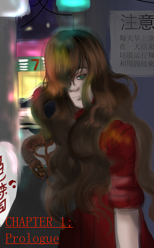
dont feel bad about any of these things, theyre the hurdles of like literally everyone starting out. word bubble order is still a hurdle for me lmfao. for some positives, i really like your use of colour - its bold, pleasing, and sets the tone really well. i think the concept is pretty interesting too, medusa is a really interesting character to play on.
given youre a new creator, can i ask if you have a backlog of unreleased pages that youre building up? having a backlog of about a chapters worth of unreleased pages lined up makes it way easier to meet deadlines without as much stress
also, have you read understanding comics or making comics? theyre both by scott mccloud, and theyre really good books for not only getting to grips with comics as a medium but also for getting inspired. they go into comic history, practice, theory, blah blah - all very cool very nerdy stuff. and theyre comics themselves! so theyre a v enjoyable and easy read. id recommend sitting down someday with understanding comics, itll blow your mind.
welcome to the tapas community, i wish you the best of luck!!