inappropriately strokes this website I just found that makes fonts
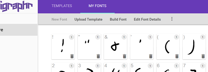
So it gives you a template, and then after uploading, you can see how your lettersize scales to "fit" with their template. You can then adjust letter spacing, letter scaling (to theirs), and then word spacing. I've made another font before but it ended up pixelly and didn't capture the overall look I wanted.
This site also lets you save as either TTF and/or OTF. OTF being more easily to scale up or down - ie good for all over usage.
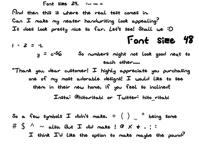
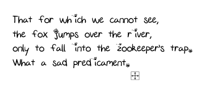
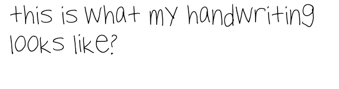
I ended up making two fonts off of two different handwritings I use. Something closer to my normal, and then a "neat".
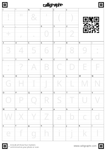
http://calligraphr.com It does have a PAID version, but I just did free. It allows just about 75 characters? So the full latin letters, numbers, and a few symbols I know I'll use.
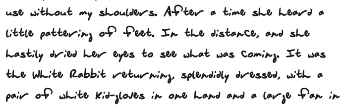
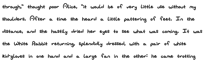
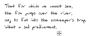
Overall I'd say I'm suuuper happy with how this site translates the results of my handwriting and the "transparency" of the letters as pieces trail off (like the end of my "h" or "f"). I feel like it really captures the "strokes" well.
I'm actually thinking of using the "neater" looking one for some documents for NTN somehow.
I did two methods. The first, I started warming up by writing down words with the pen I would use::
frog, marvelous, frost, help, coast to coast, ect
And then I started picking and choosing letters out. Once I was confident with how my handwriting was translating to digital, I just went to the tablet and wrote my letters. The worse part is my irl handwriting is closer to cursive and truncates/destroys letters (ing) and the shape of (g) or (y) will be destroyed and look like a (y). that kind of appearance just cannot translate overall to a font unless I can use a command to conjoin symbols that would replicate my handwriting like that - lots of trouble lol