So for the sake of transparency I wanna point out to everyone else that @punkarsenic and I are friends and we've both done guest comics for each others series. But also like - whatever this is a casual forum review thread, also if anything this means I can be a bit harsher than I would be with others.
On to the review:
As far as the premise goes - I really enjoy your approach to adapting Irish mythology. In the past I've compared it to Peter Jackson's approach to adapting Lord of the Rings, but recently I've been thinking that that's not a super great comparison. LotR is bombastic and exciting, and has an intense focus on making everything larger than life. There's human drama and nuance in LotR, but it takes a back seat to the action and fantasy. With There Was A War, you kind-of have the reverse approach. The old myths from what I can tell are very focused on the wars and the fantasy, and you've dived in and focused on a complex human drama about growing up & finding love in a toxic environment. I don't think that the slow pace is a detriment to the series and I enjoy hanging around all of the characters, you get a real sense for what day-to-day life in the caves is like. I think the problem most people have with meaty dialogue scenes is that nothing really happens and it's just two characters talking about nothing while doing nothing, and that's deffinitely not the case here. The characters are always having an important and meaningful discussion, and they're almost always up to something interesting while doing it.
Art wise - TWAW definitely shows that it's a learning experience, but I think it's worth noting how quickly the art & writing improves. Everything starts pretty shaky but by the third or fourth chapter the art takes on an impressive quality seldom seen in the world of webcomics. Most of the time - i'm not willing to slog through janky early chapters to get to the good stuff, but the gulf in quality between the early pages and the most recent pages is so huge that I think it's worth it.
While I don't think that Foighne represents the absolute best of your work in the entire comic (that honor would go to A Waterfall ), It is currently the high point of your most recent style, and I think as it further develops it will outclass those earlier chapters.
This is where I'm gonna get nitpicky.
Throughout the comic - and this is mostly due to it being set in a cave - there's always been an issue with the contrast between characters and their environment. For the most part you've found ways to get around this with surreal ambient lighting, but occasionally it creeps back in to the art work.
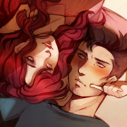
This bit from Foighne 2 is a good example of what I'm talking about.

I suspect that this panel looked fine when it was mostly just linework - but once the color and values were added in it became really cluttered and it's hard to make out what's what.
This panel is also a good example of a second issue - which is that sometimes the character poses are really janky, and the transitions between poses from panel to panel seem really unnatural. There's a section earlier in the comic with the two baddies and when I read it I couldn't help but think about this scene from food fight.
This problem has mostly gotten better over time - but occasionally it still rears its head. Lately I've been noticing it in the transition between facial expressions? It's not so much that any of the poses/expressions in particular are bad it's how they "animate" in between the panels.
Here's another bit from Foighne that I wan't to point out.

Now - every comic has it's fair share of sloppy drawings, it's just a natural part of the medium, especially when you have a tight update schedule to maintain. But this panel really should have had more care put into it, and there are other panels in this sequence that are great, but they ultimately aren't that important. In the future I would be more careful about which panels you put your effort into, and which ones you relax on. For the most part you do a good job of this, but I would be a bit more diligent about it. I would suggest during the thumb-nailing phase that you rank each panel in terms of importance, and then work in roughly that order so that by the time you're exhausted with the page you're working on the stuff that doesn't matter that much.
For my final real nitpick I'm gonna complain about speech bubbles.

So i'll start with the good - the bubbles and font really fit with the rest of the aesthetic, they feel like an important part of the artwork, they have a ton of energy put into them, and they're so much fun to look at.
The bad - the text itself looks really flat. You may wan't to try knocking down the opacity of it, or tinting with some color, or passing over it with some texture. As is it looks very digital and doesn't gel well with the rest of the aesthetic.
Second - especially in this sequence, the way that bubbles overlap sometimes makes it hard to tell who is speaking. Now the characters have a strong enough voice that I can usually figure out who's said what, but spacing out the bubbles, or tinting them so that they're color coded between characters, or changing their shape to match the "voice" of the character would go a long way.
Finally I just wanna make one really dumb nitpick about Balors design - she's always kinda looked nude to me. I guess it's is kinda the point? But it's sometimes a bit awkward. The recent swirls and flourishes that you've added to her design has helped a lot but...

The little flower thing around her crotch kinda looks like pubes???
This is mostly me being a prudish american though so I don't know if you should necessarily do anything about it.
Overall, TWAW is one of my favorite comics right now despite its flaws. Its aesthetic is detailed and inventive, it fits perfectly with the tone and narrative, and I really really care about all of the characters (except Ethniu cuz they're a little brat but I guess that's the point.) I'm looking forward to the conclusion of the series and I feel confident that your next project will take everything you've learned from this and be an outstanding series.