Third round and last one ( I guess)
@neidarous Making the speech in another font is a great idea (I might even steal). Your story got a nice harmony and the story line is interesting and developing at a nice speed. On top your art stuff looks great. Thumbs up from me 
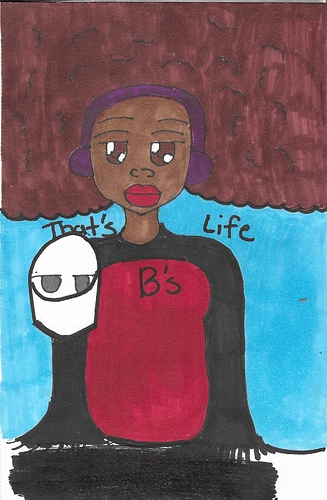
@noenoh German titel  The illustration are cute and Miriam feels like a really strong character. The town/village is quite scary but the hot guy is just
 even though he's scary too. There are minor spilling mistakes, but easily over-read.
@Nezothecat Slice of life is normally not my cup of tea but I enjoyed the first few episodes and will read on. The illustrations are a nice touch and make the story more colourful. The writing is well and it got a pleasant harmony to it. The only mistake i found were the " and “, the first once are used for quotes the second for speech. You used most of the time the first once for all your speech. But I see it a lot and i think Tapas converts it. But I don't know for sure, if you know please enlighten me.
@Tinkerton Someone is using the Mature button!!!!! Yes, thank you  I liked the few episodes i read but I won't be digging in it anytime soon. My head isn't in the right place for this right now (I also stopped my Novel with a similar topic), but when I recover I will come back. The mistake I noticed is that your paragraphs are quite big. Makes reading sometime a chore and people stop mid episodes. But the melody of your sentences are good for such a topic. Please just watch out for trolls, they come for Novels like this quite often!
@DreamyPastel Mad cliffhanger... but I am lucky and the next episodes were already published  The start is strong and leads somewhere. The good think is i don't know where and that's what you want. One think if Seth would have hit me with the ball, this ball would have went straight into his face.. I don't know how people can be so calm and that's while reading?? Just in aww.
@techstylesstudio I looove it Lucy is me in every social situation... I didn't find anything wrong, it well illustrated, as far I can tell the characters are thought threw and know their place. The colour scheme fits hell perfectly and grey haired guy is chef kiss (sorry I forgot his name). I am grateful that I found this one, it reminds me of some comic i already read but I can't remember...And it's good to know that hell is like my workplace 
@karamesser thanks for the warning and thanks for using the Mature button! Not a lot use it..
I loved the fight scenes and yes I will read on. I don't know about the nudity thing but it's well managed in your comic. The only thing I would love to see more is background. I can think that it's a lot of work but it would make the comic even better. In Ep 2. the grass texture was already a great start. I hope you get what I mean with this 
@kelsea_dove It just your first Episodes and I don't want to go rough with you. I liked the beginning and relaxing to see a few Novels from the characters POV for once. I don't (never) write from this view so I am not in a position to judge your writing the only thing I saw was the the start wit or.. or...or.., it's of-throwing and it's a shame that it happened in the first few sentences. And for my personal taste I would have cut the episode after "I should've went inside.." that would have been a nice cliffhanger. But my personal taste and not yours, just wanted to show you another perspective.
@VLN The space background was a brilliant idea, it's cute and a nice touch to the overall story. The writing is well, I didn't saw any spelling or grammar mistakes. But the font is sometimes so blurry compared to the illustration, to the point is hard to read. And I don't know if I should mentioned this because the comic is obviously not close to being realistic but I will anyway. The last scene in ep 2 is unrealistic the bird wouldn't have been shot at that angle. (just joking!)