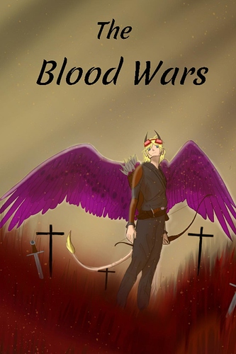
Dude, that's like, a million times better already! The dynamism of the curved grass, the low camera angle, and the more anatomically correct character all make it a way stronger piece than the original.
Darth's edits are fantastic as well. It's important not to use generic looking fonts, you want something more unique and eye catching for a cover. I'd recommend looking up how the rule of thirds works as well, it's really easy to follow, and she's used that to great effect.