The comic I work on is made to be in the style of animation. So we actually follow the animation pipeline when it comes to making our page, and that includes color.
First and foremost? Have a color guide.
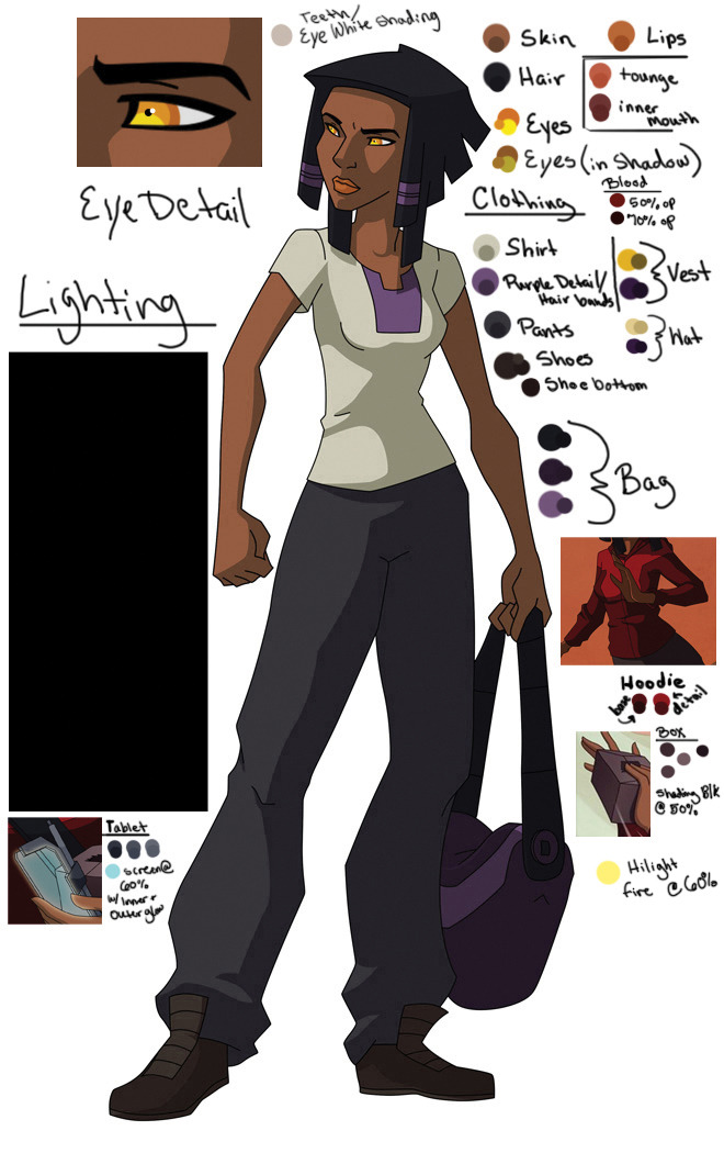
This is a a color guide that my team uses for the comic. Since I'm the primary ink/paint person I take my time creating the color palettes for each character. I select colors that are darker but more saturated for my shading (as this is what happens in real life when it comes to shadows).
To make the clean lines of cell shaded space I use two things.
1. Handy Artists Tool App - easily THE BEST money on an app I have ever spent. It was $2 when I got it and it's AMAZING. Gives you 3D head reference, arm, hand, and foot ref, and then the ability to light these objects from three different sources. Seriously, this is the most helpful thing!
2. I use photoshops Pen Tool!
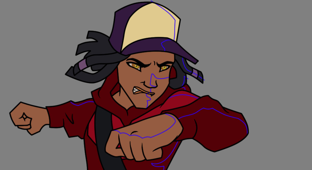
The way I go about it looks really ugly, but it works. I create a single layer for my 'guides', seperating out where my lights and shadow are. Usually I use a REALLY obnoxious color so it's easy for me to see it. Like so:
Then I shade according to my characters color guide.

The color process does not change in shading. It's the same color space across the board no matter what kind of lighting environment we're in. With the animation pipeline you continue on from here with compositing, putting background layers, character layers and any SFX into place. This also means you're doing easy color corrections with masks and color layers.
So this example page goes from here:

To here:
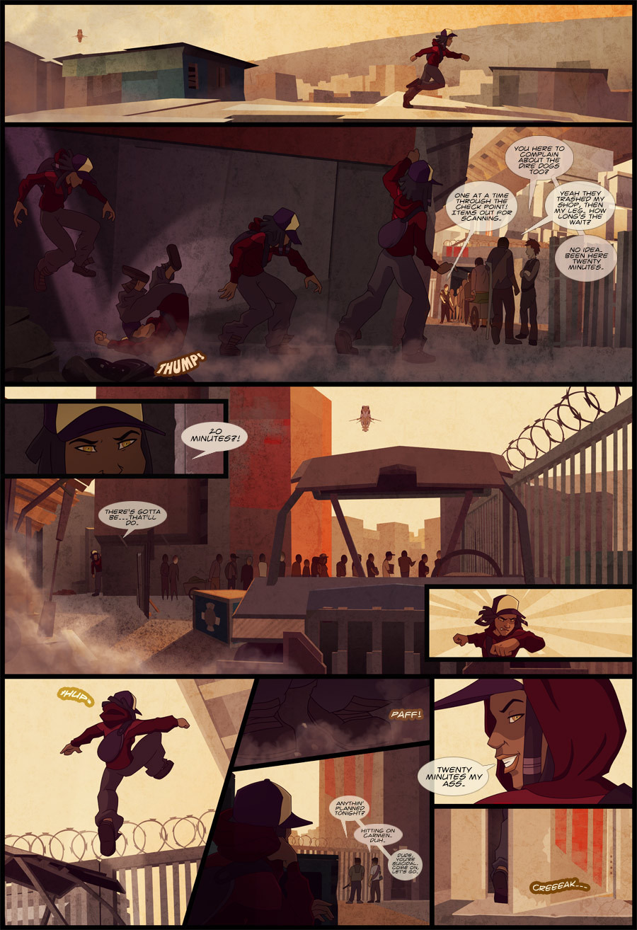
Because of compositing and the use of masks and overlays, I can use the same exact color reference, and my partner Alan composite it into the correct color space. ALL of these pages are using the same color reference with color masks, providing different moods to each scene without going insane w/ all the shading guess work.
Blue light:

Gold light:

Red light:

Even multi-colored light:

Hope that gives you some ideas! 


