@scampicub and @joannekwan have excellent points on palette and light source cues. As they said, it really helps to layout colour blocks before you even start painting. Taking into consideration the scene's lighting volume (how much light is available) in tandem with light sources (where the light is available) is awesome for value and is the first step in character/figure cohesion.
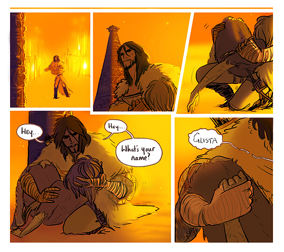
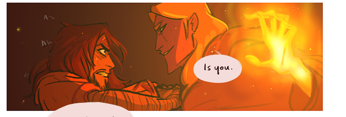
A sealant, a way to get those atmospheres to affect the characters, is to pick the main hue of what's around everyone and inject it into the shadows/highlights of your figures. Indoors, warm, sunny, midday: Oranges/reds/yellow.
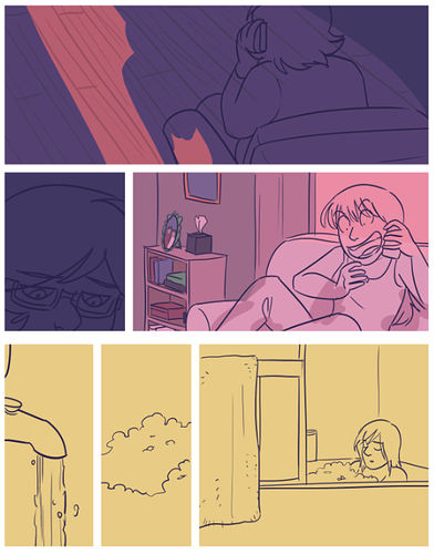
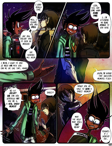
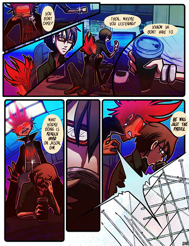
Outdoors, cool, inky, night:
Indoors, warped, digital, paused:
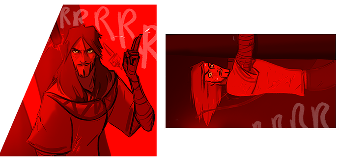
Moods have colours associated with them, even subtle ones, and so factoring the general colour mood into the tone of your page boosts the stylish twist of your work. This way the story can be told by not just words and character actions but also by hue.