I looked through your comic and my first thought is that you're being a bit hard on yourself. I expected way less from your paneling based on what you've described here, but over all I'd say the flow and art aren't bad. Flatness isn't even really a chronic problem, though I think you could do some things to improve.
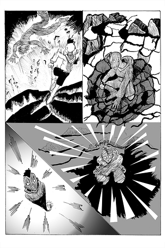
Looking at page 5, for example, the flatness comes from a couple of factors looking at the middle two panels. One is that it's actually WAY harder to draw a profile of a face and not have it come across as quite flat. Actually most of the moments of flatness that stand out come when you're drawing someone in profile. A cheat for this is getting closer to 3-quarter view, which is also challenging to draw, but will give the picture more sense of 3D form.
Additionally you use tone as just big flat areas, which reads as flat. There are no lines or shadows creating a sense of form, therefor there is no resulting form.
I personally prefer greyscale shading, but mostly when you actually use the tones to shade the form isn't bad. I'm not sure I personally love that you jump back and forth between the two, thought, but again, that might be some personal bias against tone. Your grey scale always looks really nice. And one of the later pages where the bunny is shaded has a lot more depth.
You mentioned using manga for reference images. I'm going to suggest that you try using google or stock image searches to find reference images to help you with your perspective and anatomy stuff. Work from real life, turn it into your style, you'll get something meatier as a result. It might take a little getting used to, though, as finding the references one wants can be challenging. BUT it can also help you get out of the box and find more interesting ways to frame some shots.
You could also search for a tutorial relating to conveying background, middle ground, and foreground. This might help you recognize those aspects in reference images and potentially better integrate your characters into a space where they and where they are looks more 3D.
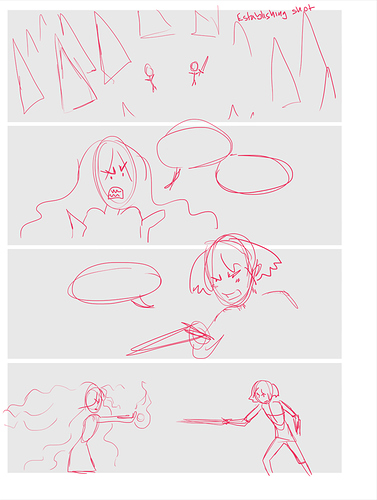
Edit: Looking at the fight scene, also want to note that one of the problems here is flow. You sometimes go right to left when it should be left to right (the punch is an example where the order is hard to understand). Everywhere else in your comic you don't make this mistake, so just be more watchful when you do action. ^^