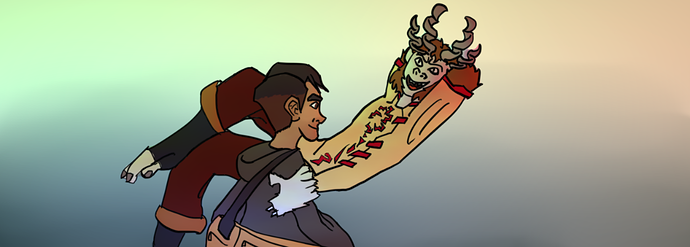
Hmmm I'm mostly having trouble making sense of where the arms connect. Like on the left side (from my pov) it seems to be the one shoulder on top and then the other two sprout from beneath that one, like a pyramid if that makes sense. But with the other one I'm not so sure. But maybe that's the hair covering up some areas and it looks fine for the most part.
The books however are a bit jarring. It feels like you drew (or pasted in) the books and then erased the lines in front while some of the upper lines remain.
If you are afraid the books will take away the focus (or any background detail for that matter), you could make the contrast high, like having a dark bookshelf will contrast a lot with his lighter body and hair. That could really make him stand out. I'd say play around with the value of the books. But personally I'd keep in some of the front lines of the books atleast. It adds more texture to the background that it feels like it's missing right now (in my opinion).