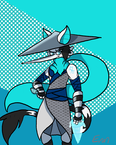
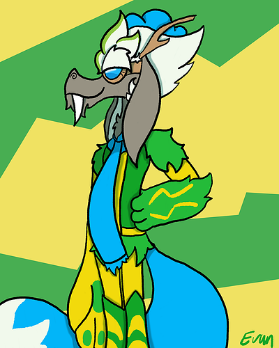
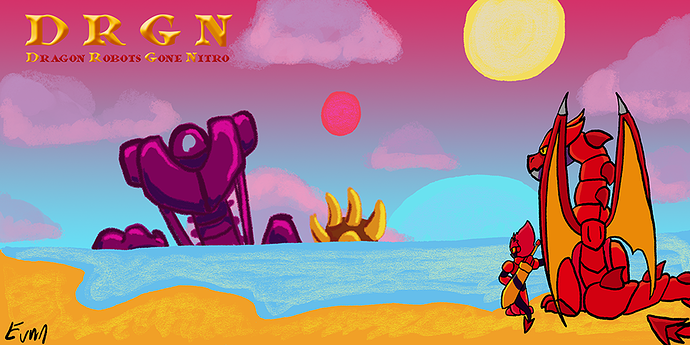
I love your ingenious character designs, and because all of them have similar colour palette, it brings the highly different characters together.
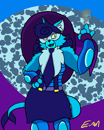
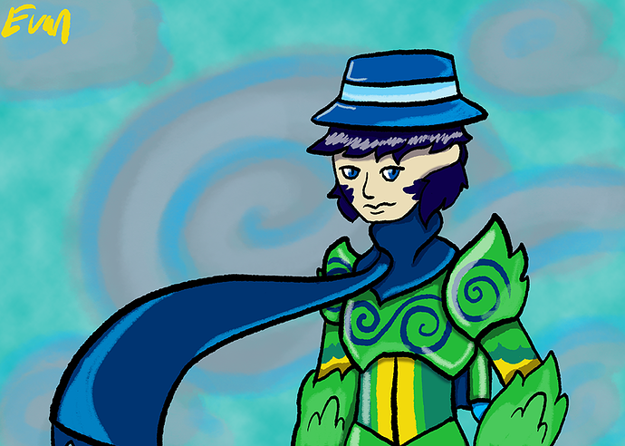
If you ask me what's missing, I would say it's contrast. Since you use pretty heavy shading and dark colours, it's difficult to see the more minuscule details. Take the third picture for example: the outline is black, her hair is dark blue, and there's dark purple behind her. It strains your eyes to make out the curls on her hair.
I would suggest you to either add highlights to the hair, or outline her silhouette with a lighter colour:

I used light blue here to go with the overall palette, but you can use white instead. To make it so that it's a little subtler, I also lowered the opacity of the outline.
Hope this helped!