Okay I don't normally give opinions, but I do have some ideas came up my mind ...
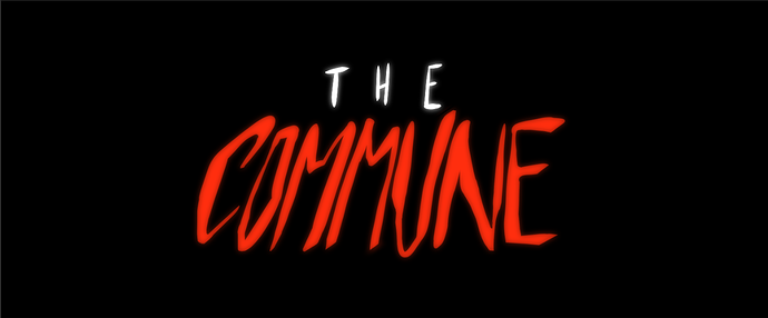
Because you say you want to go for books-- the you could improve the readability on the logo (from a distance) Is your book going to be thick like atleast 250 pages+? Think about how large the logo would look on the book spine.
I say 'The' can go a bit smaller, and broaden the 'Commune'. (you can play with the kerning distance) That will give more 'presence 'to the book (and to compete with other books in someone's bookshelf-- when you glance from a distance you can easily pick up the book title)
Now, about the "commune''... the uneven slant the gives me some punk, rebel-like feel (and I feel like the members may gain leverage over the cult/leader as P.O.V. is on the 'rebels') But if you want to give readers a sense of the unshakable authority from the leader, then it makes sense to have more straight design. It gives a bold, unshakable feel.
Hope this helps!!