It’s kind of hard with these because a good majority of them are free flowing on the page, with each one being pretty dang close to the following and previous illustration and not within any set border or panel, which means the backgrounds are most likely going to have to connect somehow in some way.
This is just how I’d personally go about doing this with your layout-
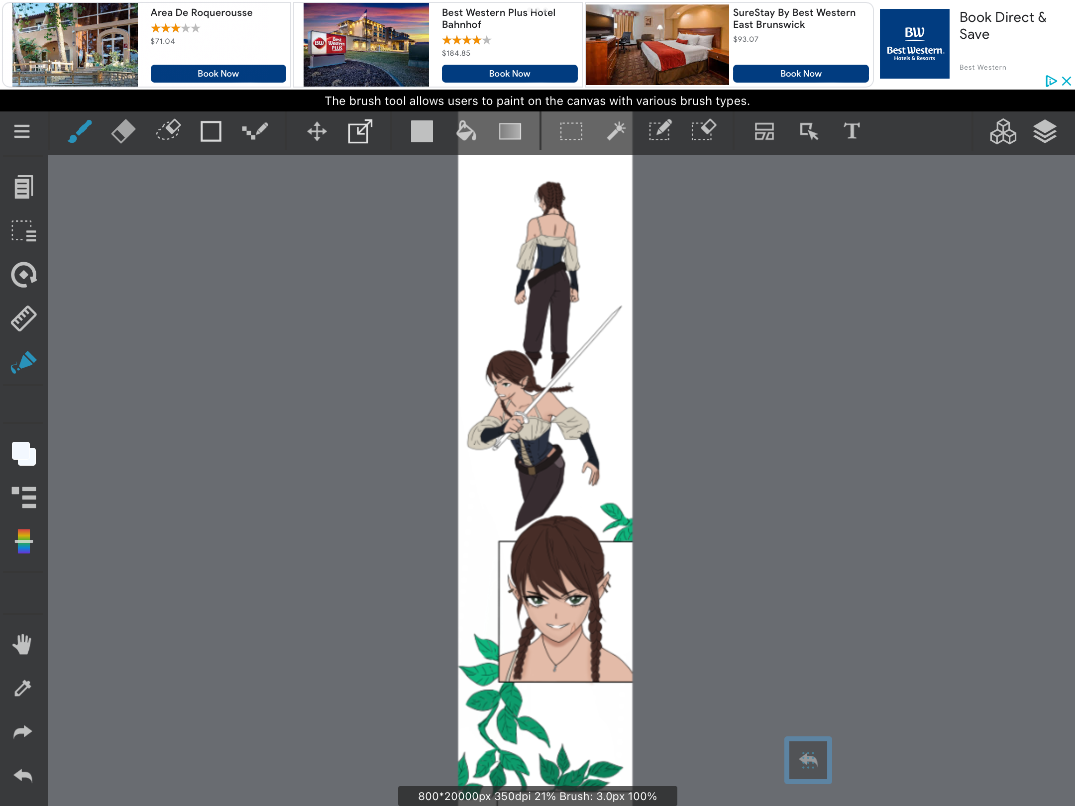
Honestly, I’d personally prefer the first two illustrations to be spaced out more with room to breathe from one another to slow down the pacing and also because they feel like more impactful shots than some of the others; plus it’d be easier for me to figure out a background xD. I’m assuming they’re introducing the character as well. I think I’d go with either a gradient behind the character, perhaps a light blue the color of the sky to establish some type of setting and also to get rid of a bunch of the white space behind the character, or, some thick tree leaves above her (assuming she is outside) maybe blurred out a bit to keep the focus on the girl. That could be nice and fit with the leaves you have going on throughout the page. When Introducing a scene, it’s pretty handy to give some type of information to where the character is in accordance with their surroundings, you have more of an establishing shot in a few panels, but you don’t really want your character just kind of running around in white space.
For the 3rd panel, I’d probably do a gradient of the sky as well if I went with the trees for the first 2 illustrations or vise versa.
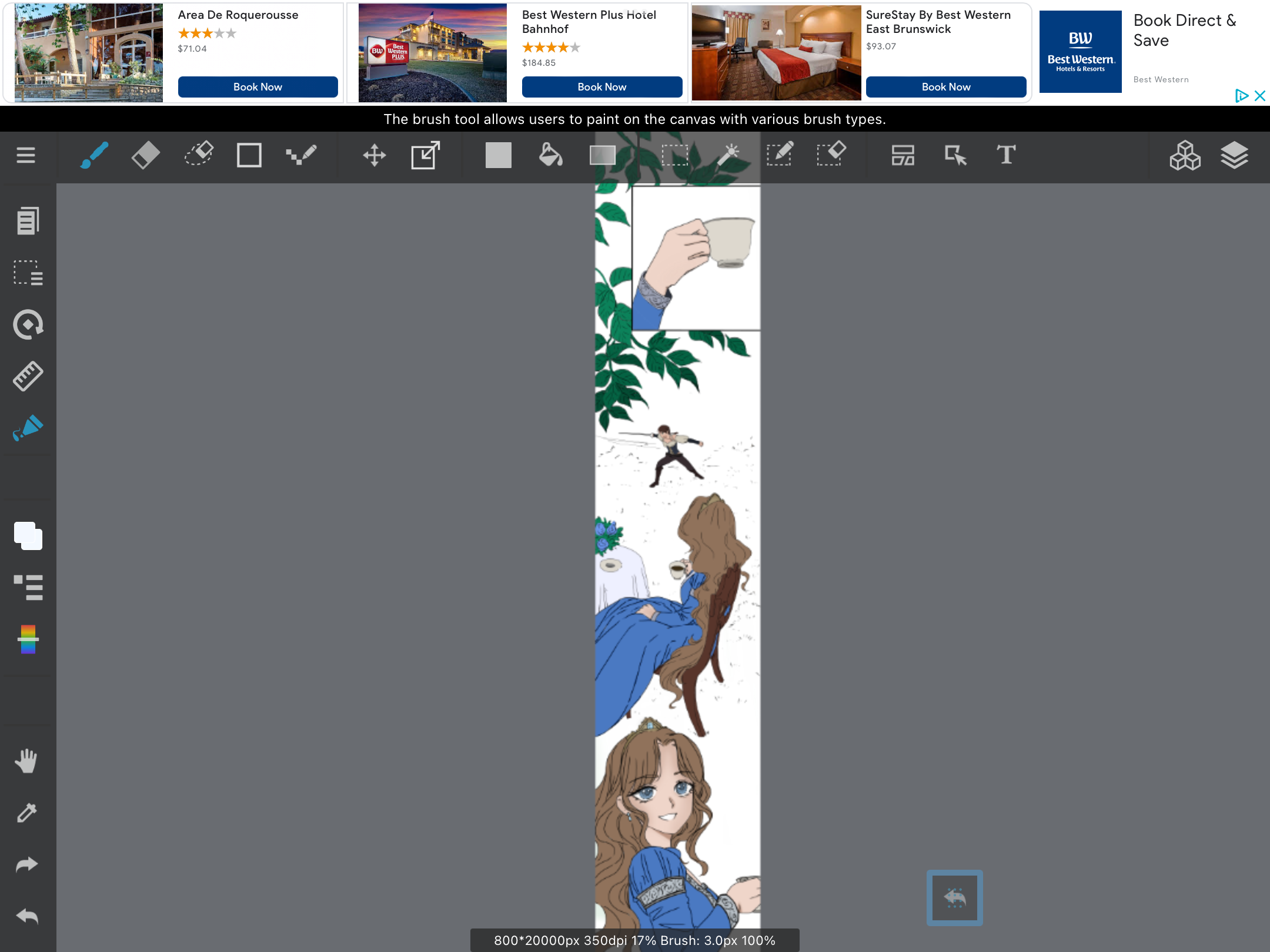
I think you can get away with a plain white background of the hand holding the tea cup, it’s a less important shot but still has some impact, and i’ve picked up that many webtoons tend to leave shots like that plain white to create some ‘suspense’.
For the 5th shot, i’d definitely recommend doing something more detailed. The sky fading into the scene and the girl standing on the grass, mountains in the distance, or whatever the setting may be. Considering your comic has an anime style, im assuming it does have some anime/manga inspiration to it. Maybe try looking up manga pages and anime scenes to gain some inspiration, as well as looking at other popular webtoons and webcomics to see how they handle backgrounds.
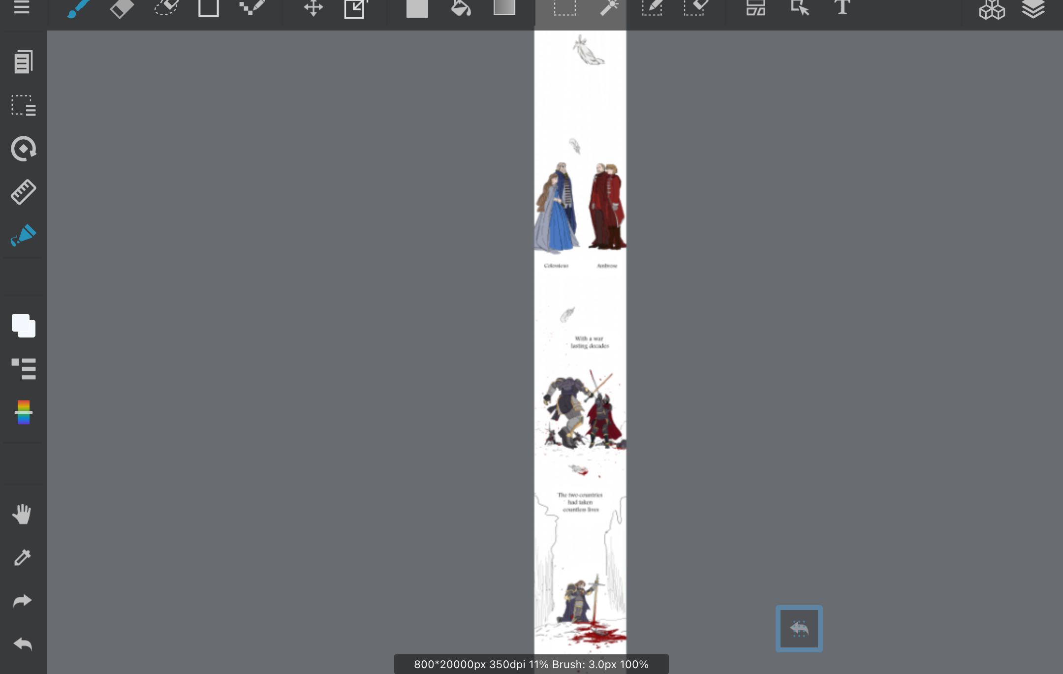
For your last page, I think you could probably change the color of the entire page and make it something darker, like gray or black or a dark blue/red, considering it looks like it’s a darker scene. Then maybe just coloring the ground for the 2nd to last panel and doing something more detailed for the actual last panel.
Honestly, there is a lot of routes you can take with this, It’s hard to know what to do when you don’t expose yourself to or actively study panels and media made by others, and even if you do, it’s still pretty hard without reference. I have an entire pinterest board of like almost 400 pins that are just manga, webtoon, and webcomic panels (mainly manga tho lol which is unfortunate in the coloring aspect due to them mostly being black and white) that I take inspiration from when I’m not sure how to make a background or create an impactful panel, etc. I’ll leave it here and you can look over it if you want to get some ideas and see how others achieve backgrounds for similar scenes and panels!
Here it is if you want to check it out
Good luck with the backgrounds! Hope this is somewhat helpful, but i’m pretty bad at explaining things sometimes haha. Your storyboard artist did very well and I love the art style you have! It’s very cute and pretty :^).