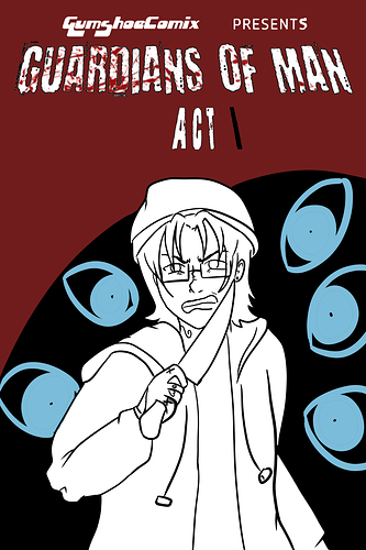
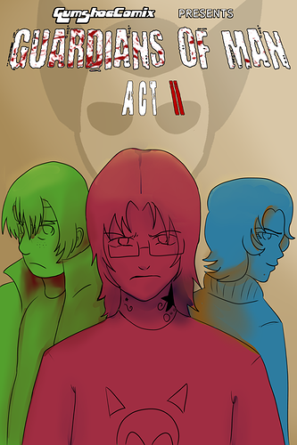
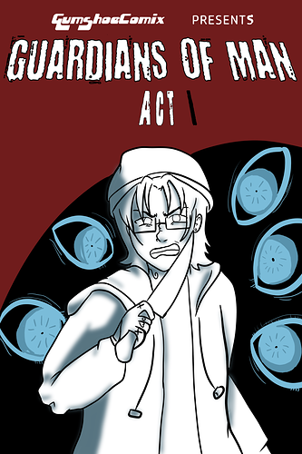
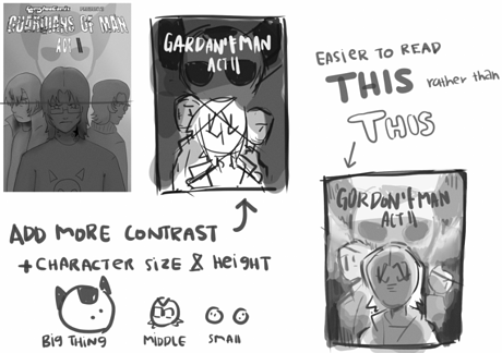
I think from a compositional standpoint, the covers are quite strong! The figures are clear and you do well to utilize the positions to put focus on Nick. I think right now, my biggest gripe would be the the text? It's a little small and while the concept of the blood splatter is super cool, it ends up making the title hard to read. The text on the cover for Act II reads better, but I still think the text could be bigger.
Just a suggestion, but for the Act I cover I think it would be more striking for the cover to be more symmetrical. Right now, there's more eyes on one side and the direction of Nick's gaze seems to veer towards an object that's off to the side. Having the eyes be more centered and symmetrical would put more focus on the central object(Nick) and look a little cleaner. If you also shift the eyes so that they focus on the reader, that would also really add to that intensity you're trying to portray.
You use awesome shading on the Act II cover that I wish the Act I cover has!! Using just a bit of shading on Nick's figure in the Act I cover would go a long way into making him pop more.
Anyways, that's mostly my suggestions lol but I do really like the concepts of these posters! Just some slight tweaking and I think they'd make for very strong covers to draw in new readers