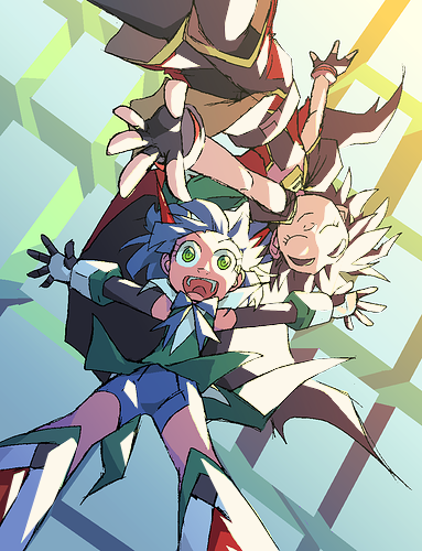
The reason I ask is because the setting, specifically the time of day because the characters in this case are suspended above the surface of the earth (or whatever planet this is), would inform the color palette of the finished image. Regardless of if the characters are in a more fantastical setting where lighting isn't 'accurate to real life' (unless the properties of the light are significantly different from real life, I don't think that's an applicable excuse), the environment should color the characters and objects in it. And there's no way that there's a sun that's this yellow and this bright, and also "near the horizon." If it's near the horizon, it's going to be much more orange in color, and if it's that bright a yellow, the sun is going to be higher in the sky, meaning the highlight wouldn't be coming from one side, but more from above.
To the flat lighting point: I agree that it was a big gamble, and I also agree that it really came out okay. The brightness and hue of, what I like to call, post-it note yellow (also see butter yellow) somehow how doesn't jive with the rest of the piece. The color is so yellow that it's bordering on green. To me, this is a midday yellow, but from your explanation, it should be more golden, more red/orange. But not too red; tried that and it didn't look all that good or convincing. Honestly, I think this yellow is just too dark. And there are a number of uninterrupted chunks that flatten the image down (I'm thinking it only looks flat because the yellow is only a little bit lighter than the lightest flat color, which would be the red girl's skin). Now with cartoons you can get away with a little flatness, but in this case to me it's too distracting because it takes up so much of the image. Honestly, I just think you can get away with a much paler, bright color. Case point:
With a brighter color, it matches the background better and ups the contrast (even if you don't care about that specifically).
The other reason I asked about the setting is because it affects the color scheme. Like if it's midday, the colors are somehow too dark, and if it's early evening, then the colors are not orange or red enough.
To the color scheming point: I don't think the color scheme is bad, I just think it's boring. Maybe the blending layers used washed out the colors, I don't know. I don't really have much to say here without just critiquing the color palettes of the characters... And I don't think you're looking for that, so I'm just going to move on. Well I do have one thing: I think red girl needs another, darker brown and I'll leave it at that.
Eeehhh... hmmmm.... Sure! I don't think it needs to be that cool given the supposed time of day, but sure.
(I just realized, as I was writing this that blue girl has red horns and that those are not apart of red girl's outfit. Mind you this topic has been out for 3 days. Make of that what you will.)
To the BG coloring point: I like the the simplicity of the background. Based on your explanation, it seems like it was more work than it looks. I think the only thing that could elevate it for me would be making some of the outer buildings darker to make the girls stick out more. Other than, it's pretty solid.
Okay, so the reason I asked this question was not in regard to how the figures were constructed, but more about the shading. I think you could've added more shadows, and I think if it was more clear what was in front of what, the shadows could be more focused. Significantly more prominent and/or darker shading would've made the flat lighting pop out even more.
Conclusion
As it's stands, despite what I said earlier, the things that grabs my attention when looking at this piece is the blue girl's eyes, and then dark cape behind her. So that yellow, is only so distracting. And I know I was particular about setting and color before, but... Well if I just scrolled past this on insta or twitter, I could write it off as being a cool pic, but after sitting on it for a few days it just made me realize how bad that yellow looks (and how it probably didn't make sense time-wise). I've also worked with flat lighting like this before, and I know it's difficult to make it believable because we as humans know light doesn't work like that. Also and backlighting; this should have backlighting. Everything else is decent to good, but that probably comes with the territory since this is the first time, I gathered, you've drawn something like this. Trial and error as the saying goes.
So yea, that's what I got. Something tells you might not be responsive to most of what I've said here. Couldn't tell you why.


