All right, I'm going to be potentially quite critical and nit-picky, but it's because this comic is so very close to being star quality. So if I sound harsh in places, please remember that it's because you're doing well! This is a strong Fantasy comic with a lot of potential.
To start with the nit-pickiest comment possible... that logo... specifically the "or". The rest of the logo is all really fancy looking and shiny 3D effects and textures and then there's just this "or" plonked on there in black and what looks like Arial font like you didn't really know what to do with it. I'm sure you can integrate that "or" better. It's a small thing that'd really lift that logo and the overall first impression of the comic.
I'm not generally a fan of starting with a bunch of world building narration, but this comic actually does it pretty well by not skimping on the visuals while doing it. The shot of the city with the huge statues looks awesome. Love it. Generally overall, the world building is really strong here. The setting is interesting and feels really well realised, and the magic system is intriguing and I bet there will be some cool action scenes to come. It reminds me of the kind of detailed world building in the work of fantasy writer Brandon Sanderson.
The weakest element is probably the writing, by which I don't mean the storytelling (which is strong), but just the quality of the English. It's often quite stiff sounding, and in places the grammar and sentence structures are a bit off. I'm guessing English isn't your first language? Running the dialogue past a native English speaker who is a decent writer would really help things feel more natural.
Also try to give your speech bubbles a bit of attention. They're often leaning at these diagonal angles and a bit rough, which is dynamic, but sometimes the text doesn't quite have enough padding, and they look like they were drawn in a hurry with thick, inelegant tails. I know it's the most boring part of making a comic a lot of the time, but neat speech bubbles do make a difference.
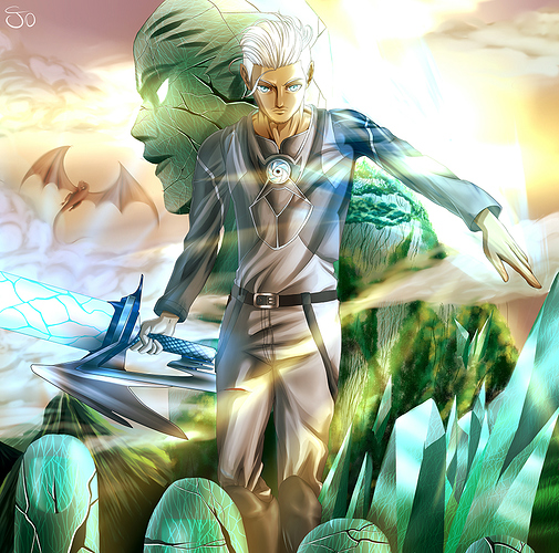
Finally the art. It's overall pretty high quality, reminds me favourably of the work of OEL manga artists like Sonia Leong. Sometimes the tendency for characters to be looking straight ahead makes them look a bit vacant; I can totally see you cloning and flipping the eyes to avoid the dreaded 'drawing the other eye' problem. It's a clever solution, but just be careful, you're sometimes placing the eyes just a little too far apart at the moment, and drawing just a few too many panels of people looking straight at the reader.
Sometimes the backgrounds feel a bit like in an effort to deal with just how epic the setting is, short cuts have been taken like using a grass texture brush, textures or 3D model renders with a filter thrown on them etc. This is totally understandable since the scale of the comic would be intimidating for anyone, but I'd advise experimenting a bit with how to balance these shortcuts with matching the style of the backgrounds to the characters and making the way scenery is drawn overall feel consistent.
The colour palette is very strong. and atmospheric, with a cold feeling suffused with blue greens, and there are some nice lighting effects going on.
Overall, it's a really ambitious comic in scale with a strong setting, aiming for Game of Thrones style family drama and political intrigue mixed with an epic high fantasy world. Due to that massive scope, some artistic short cuts have been taken, and the main area for improvement I'd say isn't to stop using shortcuts (that would be impossible while trying to keep an update schedule with such an epic comic), but to just refine how shortcuts are used to make the comic look more consistently polished.