Thanks everyone for your feedback. I've read comments about 3 times to make sure about changes I was going to make for my manga:
1 - The flashback is confusing, and needs a clearer narrative. @Cavechan said that I don't think you have to spoonfeed readers that it is a flashback, especially with it being so short and at the beginning of the comic, and I agree with it, but I think I need to show more the difference between past and present. The sepia idea from @joannekwan (But if you want a clearer distinction between past and present, you could do a quick sepia overlay on the flashback pages.) is clearly going to make a difference;
2 - @jensrichard77 said Some space between panels or some border frame would help separating things, is definitely something I will add as soon as possible. Readability is crucial for online comicstrips!
3 - The manga's tones/shades may be too dark. I've always liked drawing extremely dark shades, however I might want to reconsider my palette;
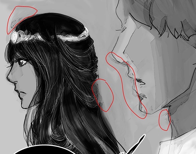
4 - Cleaner drawing style! Sketchiness is good but too much makes the manga look unfinished as @Cavechan said.
Thank you everyone for your comments. I really appreciate you taking time to have a look and leave feedback. Please do not hesitate to give more criticism.