Oh, there are so many fun things you can try! I've completely changed my attitude to vertical comics over the past few months, I absolutely love them now. They're extremely fun, I find them easier to lay out, and you don't have to fuss so much about how to arrange elements neatly on a single page.
Here are a few things I do;
- Scrolling gradients! I'll have one scene flow into another by gradienting between the backgrounds. You can also do this with landscape elements like leaves, interior things such as curtains... I'll be doing it more often with starscapes, because mine is a sci-fi comic. This is great for pacing, and for changing camera angles, because it adds time between the panels. I do this in my most recent page: https://tapas.io/episode/2135014
- Looooong backgrounds! I'll often draw one clear background in an establishing shot and scroll down into it, making a big feature of it. The benefit of spending time on such an establishing shot is that I can then cut and paste elements of that background with a slight gaussian blur in contained panels. I've started doing this a lot more, and it shows up quite a bit in my two upcoming episodes. (Which I can't share yet, unfortunately. BIG spoilers.) It's a quick and easy way to keep the scene placed within its environment. The only time-intensive part is painting the initial large background.
- You mentioned this, but the freedom to not have speech bubbles contained within panels is amazing. I was always tripping over that before. It'll be a pain when I have to reformat my panels to pages for printing, but right now, it's glorious.
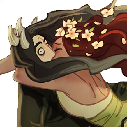
- Things popping out of panels. I do this a little as well. Some of my characters will have an ear, an arm, or a hat break the panel border at times. While in a page format, this could block off other panels or make the page look messy if done too often, in a scrolling format, there's a lot more freedom.
- Pacing! Vertical comics give the creator much more control over pacing. While there are pacing conventions in comic books, such as readers typically lingering longer over large panels, and slowing down with large gutter sizes, you're still relying on the reader knowing how to read a comic. A newcomer may whiz past that big, showy panel and not slow down at all, because they're not practiced with actually reading a comic and they don't know they should linger there. In a scrolling comic, you can simply add more empty space between panels, which have to be physically scrolled through. This empty space can allow the tone of a previous panel or scene to really sink in, regardless of whether the reader knows they should slow. You can break up the empty space with more dialogue, or simply let it exist on its own.
I'm definitely still learning, but I hope the above helps! (I love your comic, by the way.) I've been taking a lot of cues from these comics, the artists are all amazing with how they use the format: