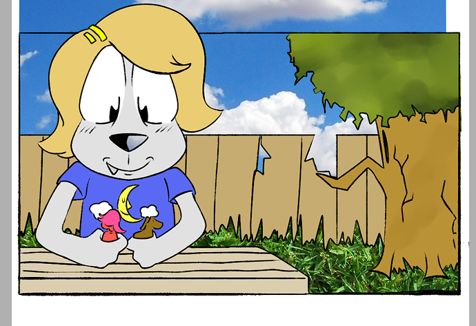
I think it's fine, all things considered. Your art style is bold enough to make the photo textures to look like they fit in, in a whimsical way. Personally, I might've used a grass photo with a more even color, y'know? A little less contrast, since all the other colors are so smooth.
It also helps if you keep things to scale...like, those blades of grass in the photo are way too big considering where they are in the scene. If you want your textures to look less distracting, you should either pick photos that have the right scale, or resize them as needed.
Now, if you want suggestions for related techniques:
-Always adjust the colors to fit the scene. If you just throw together random photos without doing any color work on them, you can end up with a sort of 'fabricated', amateurish look, depending on your art style. In any case, it never hurts to put in the effort.
Example:
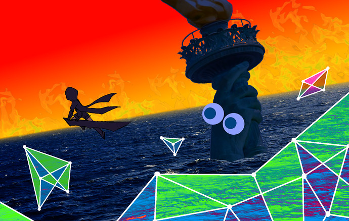
This was complicated to put together, but all the techniques are pretty basic: I increased the saturation of the ocean to make it 'bluer', and the flames are just on a transparent layer over the red/yellow gradient.
There's also a bit of a yellow blur over the edge of the ocean, just to help sell the illusion of distance.
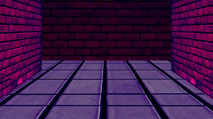
-Make your own angles. It's very difficult to find photos with the right angle for any given scene, especially if you're limiting yourself to royalty-free images (which you should be doing), so you should learn and get used to rotating flat textures into the right angles to use for floors and walls.
Example:
Both the bricks and tile were originally flat textures, resized and rotated for this hallway shot. I assume Paint Tool Sai has the capability to do this (Paint.NET does, and it's basically freeware). If it doesn't, I think you really should find a program that can; it comes in handy a lot once you get the hang of it.