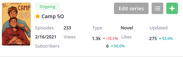
Yeah, like @nostalgicroxas said it's meant to indicate if the story is a novel or comic. The spacing also confused me, it just seems too spaced out for my personal preference. Especially since I use split screen a lot and it doesn't translate well (photos attached are an example of previous look and new look in split screen).
Personally I kind of wish this specific part had been kept the same as before. I like the way everything was spaced out, I feel like it made it much easier to read.
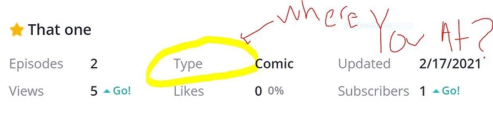
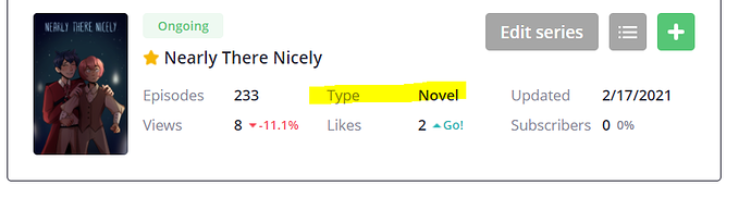
Aside from the removal of sub and word count, and the ongoing/completed tag, the only change I'm able to notice here is the addition of novel/comic type but I think those probably could have been added as a symbol indication (the ones that tapas already uses, the open book to indicate novel, and the comic boxes to indicate comic) And that could have just been added by the story title.
Not sure if that's something else that can be discussed @ratique? I feel like this is more of just a personal preference though and overtime will get used to it.
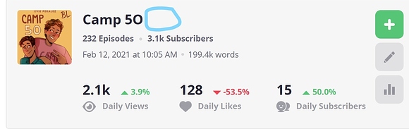
Oh and I also like that now we get to see the full cover page instead of the thumbnail! Though again I think that's something that can still work with the original formatting.
(before) (I think the ongoing/completed tag and the comic/novel tag could be placed somwhere in the blue circle or in line underneath with episode and sub count)
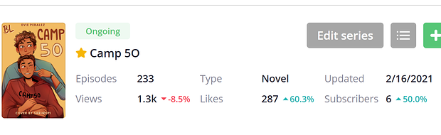
(new) (half screen) (spacing makes everything look shifted and wonky)
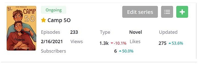
(new) (full screen) (everything in it's place, but spacing still makes it feel awkward and hard to read, at least for me)