I'm in the mood to do some reviewing.. so here it goes:
(I apologize if it's not sugar coated!)
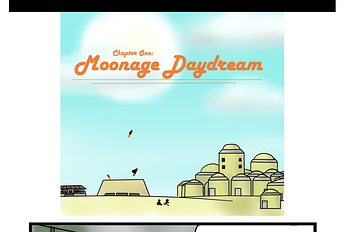
The very first thing I noticed was the awkward spacing and the messy speech bubbles. With the scrolling format you want to give your images room to breathe! For example your disclaimer is right on top of your cover and then you have a very minimal space between the cover and the first panel:
Also this is more of a personal preference thing - but I think it's odd that you update the episodes instead of just adding a new one. Not only will a lot of readers miss this - but you are also missing out on a lot of new readers because your comic will appear less in fresh.
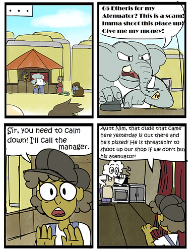
Back to the speech bubbles... this panel is a good example of some things you need to work on:
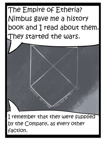
1.)Font sizes - It's odd that you are using two different font sizes in one panel
2.) Tails intersect messily with the bubble - and the bubble shapes themselves are messy/ uneven
3.) Spacing of the text - it would be better to center the text and space it out more evenly. There is a wonderful website that goes into depth on speech bubbles and how to lay them out but I can't remember it right now 
I will link it if I can find it again!
I do like your use of different fonts for different characters, it immediately gives them a different feel- but sometimes you sacrifice legibility for mobile users.
The use of the same sized panels in two columns gets quite monotonous after awhile. I would recommend breaking up the flow with different sized panels and spacing. This would also allow for more room for your speech bubbles.
Just an FYI these four panels seem to be duplicated :
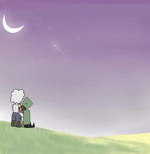
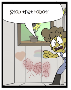
I do enjoy your character designs and world building. Everyone has a clear design and color palette. I also like that you take the time to add little details in the backgrounds - like these drawings on the walls:
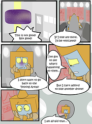
I like that in 'Life on Mars' you started taking the speech bubbles out of the constraints of the panels. It makes it feel more interactive:
I also like that you started experimenting more with panel shapes and sizes. But the comic still feels claustrophobic. Don't be afraid of negative space! It can be just as powerful and important as the occupied spaces.
In 'Changes' your lines are a lot cleaner and the improvement is really evident.
I hope these helped! Good luck with your comic and happy creating!