I was waiting for Enigma to finish the review but I'm impatient. Let's see... Melted is the last one, and the one with the least link clicks is Aegis since everyone else has a review already.
@Hexigate 's Aegis
The first thing I want to note is with the nature of the oldest content. The foreword clarifies that nicely, but keep in mind that to get to the new good content, you're asking the reader to sit through things you keep insulting in the descriptions, which is a presentation turnoff. Be a little easier on yourself! The art might be shaky at the start but you've got a good sense of composition, though the biggest problem for me ends up being too many estabilishing shots rather than the quality of them.
I've read the entirety of Pilot then skipped straight to the last chapter; it's a good story but not my cup of tea so I'm looking at this from a technical point of view.
Art
It's interesting to see your art growth journey through this comic and see even the little things change! However, I think a few problems stay, and that's mostly with the shading. Because of the brush you use on everything without much stroke variation of stroke, everything feels like the same material, even the characters. Clouds look like metal, characters look like statues. You don't have to change the brush, it does a great job especially in the Book 4 cover, but I think you need to plan different setups of opacity and flow for different things. Clouds for example need wildly varying shadows, some hard and some soft, to really give away their depth, while characters might have softer or harder shading depending on the clothes, skin, or even different brush motions to differentiate their body's materials like the scales??? on Xerans.
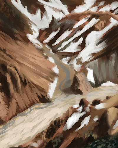
Here's a visual example to help. This is a photo study I'm doing for an art challenge during the quarantine. I'm using the same brush in this whole picture minus some areas with airbrush, but for each part of the rock, snow and gravel, I'm using a different motion, like tapping the brush, semicircles, straight lines or scribbles. Each one gives a different form, and also to blend the colors better, I tried giving every "texture" different opacity settings.
From your comments, there's a lot of worries about anatomy, backgrounds, etc - but I think you've made good progress on those, and maybe something that'll get the art confidence rolling is to render them decisively while still doing it in a timely manner.
Story
Your story is pretty good, though I'm out of the loop. The worldbuilding is awesome and so is the world, Reese is a very nice person, which is a pretty fun break from the hardass and detatched detective stories everyone has seen a thousand times, and the interactions are all very genuine. There are also a lot of silent moments that really work, and that's just as important to let the art and environmental storytelling through! Nice work, no problems there.
Pacing and Lettering
Small section because there's very little to say. As I said at the start, there were a little too many estabilishment shots at the start, but in the latest chapter that seems to be going fine. With the lettering, it's very nice, even back then it's readable, at a nice size and distinguished from the background; but I'd also recommend the crowd dialogue to have a little bit of color behind it to distinguish it from the lineart. It's still easy to read, but in some scenes it seems to disappear in the shadow and that might cut off lines unintentionally.
So overall, you're aware of what's going on with the comic and working on it, and that's great already. You've got a good project on your hands, and that was true even before, because it's letting you improve on a lot of skills at once. My suggestions are really just to find ways to make it more fun and easy to work with the art so there's fewer frustrations once you're done, because the rest is already very well made.
@Hatteri 's Melted
Like Aegis, not my area of love, but I'll do my best to review it, and I'm reading the first chapter.
Art
God damn, you're asking me what I think on the art? I dream of the day I have this much lineart and page control!  Strong lines, stronger still sense of distance and mood lighting. It's all amazing, there's very little to say! The only concern would possibly be with some textures - I'm not sure how you're going with the schedule, but keep in mind that you can work a hundred hours on a page and people will eat it up in like a minute, it helps to save time by not detailing every line in the wood. Another thing might be some of the effects, since the nature of the comic is psychological, it might be better to divide the uncanny from the normal with a little bit of opacity change - the smudge on the meat's smoke feels like the visual distortions, for example - but that's on you to make them close or not.
Lettering and Pacing
Also short because there's little to say. It goes without saying that the pacing is well done, since it's more character focused so slow is the right one, though I can suggest working a bit more with gutters here or there since a frame goes into the next with very little break. The lettering might be the rougher part - it's readable, but some of the font choices feel a bit too formal or even not like they belong in the object or dialogue. The phone looking like Times New Roman is the most striking one.
Story
Being a character study, there's not much to say when you're looking at only part of the picture. However, all the interactions and the slow moments where the mental issues come up all feel very real, so that's already pretty good! My only issue would be with the slowness of some more surreal transitions, since you start doubting if that's actually supernatural since there's so much focus on it. Maybe it should be at a faster pace and have less estabilishing shots? Hard to tell.
Overall, it's a really good series! Way niche, for sure, but it's clear that you love it and it shows through. The adjustments are mostly suggestions and are far from huge issues with the comic. I wish you good luck!
(also Tapas' servers seem a little slow because some pictures started failing to load; I doubt it's problems with any of your files since refreshing fixed it)
Alright, now I can plug mine! Still getting there, I'm FINALLY at a new intense scene to really go all out, but I'm open to any advice. Something that came up frequently with other reviews is that some terminology and concepts are confusing, so if you guys can clearly pinpoint that if it's a problem for you, I'd be really thankful!


