I have to say that your art in general is really amazing. It is solid and I can tell you have a good eye for details, proportion, and paneling so if you keep going and going you will consistently improve and be able to move to a higher level. If you don't mind me asking, how old are you? Or how much training have you had? I think knowing one or the other would be helpful in giving some advice.
Actually, I think what can really help you right now is learning some graphic design. Graphic design and comics are closely related in that they both are trying to clearly communicate with an audience. Optimizing each page for the format, consistency, and cleaning up are things that can be worked on. They're all related so I'll give a breakdown.
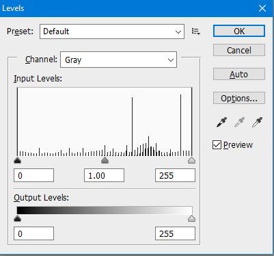
The first big thing I noticed is that your black color is not pure black. If you are going for strictly black and white, then black should be #000000 but when I eyedropped it, the black is #35363a which is very far off. I know people will frequently say "don't use pure black", but that is only for color works. When working in a black and white comic, you want to use pure black. Also, your whites aren't pure white. The scanned pages need to be cleaned up more. You might also have to turn up your monitor's brightness if the dark grey looks pure black on your screen.
Another thing I noticed is that sometimes the linework looks inked and sometimes, like the greys, look like they are done in pencil and sometimes it looks CG. You should stick with one medium - I would suggest ink by hand and then do all shading with CG. Or if you want to really look like a manga then you should use comictones and I can explain more about where to find and how to use if you like. You might also want to invest in pen nibs and ink if you haven't done so already. I can give suggestions if needed (just don't have time now since it's past my bedtime.... eek).
I know people have mentioned the type before and I know you have cleaned it up multiple times already, but it can still be pushed further. For example, you don't need the asterisks for the SFX, "I don't wanna die" should be on two lines, probably in a bubble but since it's in the background it might not have to be... and if it isn't, then it should have a black stroke around the letters so it isn't blending into the background.
What program are you using? Knowing that will be helpful in giving more tips about how to do these things. I know how to do them in Photoshop and CSP but kinda pointless if you don't have either. lol