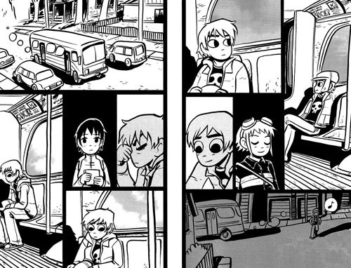
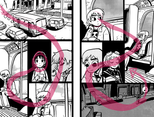
I think that example of Scott Pilgrim are not really good examples, the page with Knives is a-OK BUT the page with Ramona at the center is really misleading. It's a really good example on how a wrong panel structure can be so confusing.
The way I read is like this: Panel 1, Scott is serious, panel 2, thinks of something good, panel 3, thinks of Ramona, panel 4, put his hat on and now is happy, panel 5, gets of the bus.
Because panel 4 is so large it sucks the atention of the reader and misleads you to think it's panel 2. That's why it's important to always keep the large panel first and have the little ones just to complement the big one with smaller actions. If not, it will lead to chaos.
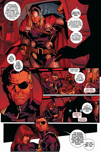
And don't get me wrong, chaos can be awesome and I'm all in for weird flows, but I think it must be reserved for chaotic scenarios, like this one from Hawkeye by David Aja
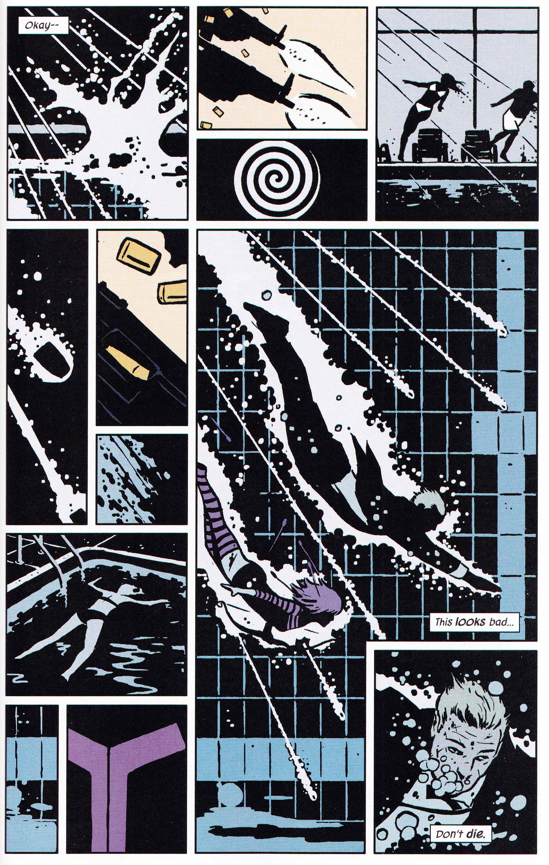
The big panel has the two characters diving into a pool, the flow is chaotic and can be anything that the reader wants it to be. All the small panels are just there to give context and acknowledge of everything that is going on around the action.
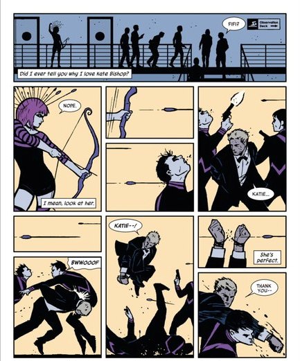
In this other example the panels with the arrows flying and Clint tackling a goon can be a little confusing, but I think it doesn't break the flow by having a little detailed panel with just two arrows and below a high contrast area that will catch the eye of the reader. I think it's a really bold move and one that can be easily done wrong.