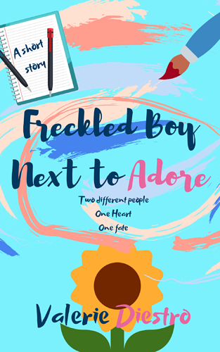
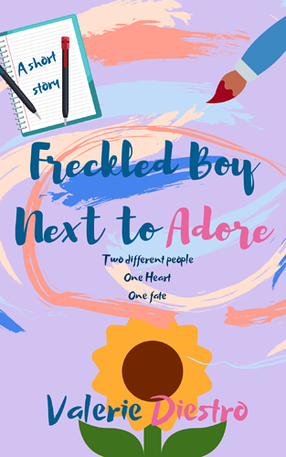
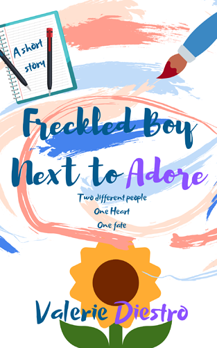
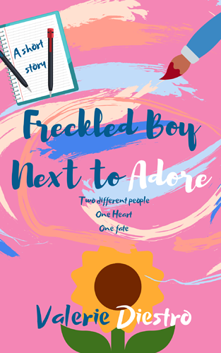
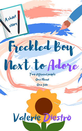
I think all of these need work. The text, as said by Nail, is hard to read.
I humbly submit.....
a) Pick your color balance- either light lettering on dark(er) background OR dark lettering on the lighter or white backdrop.
b) The lettering needs (In my opinion) a stroke (outline) or drop shadow to make it standout.
c) Composition-wise, it's very wordy. "A short story" if that's branding or a reoccurring logo then it's fine, but if that's there to simply let us know it's a short story then I think it's unnecessary.
d) The "Two different people, one heart, one Fate" sounds like part of a pitch, but doesn't really tell me anything. That's like a generic -love- description and could have been done as easily with "A short romantic story" in the upper left icon.
e) Good that you didn't use too many fonts, but I'm not sure why certain words are in different colors. 'Adore' is probably the female lead or other half of the couple, but then the author's name gets the same treatment. Not so sure the author needs that extra....work.
My fantasy cover would have the flower much larger and central and done in the same paint strokes as the background details.