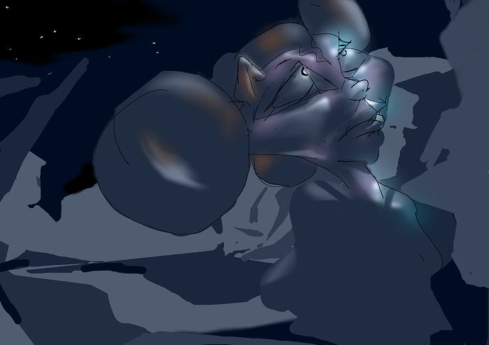
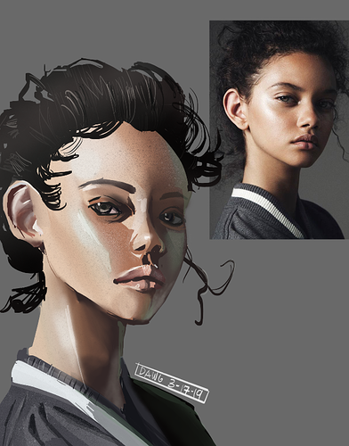
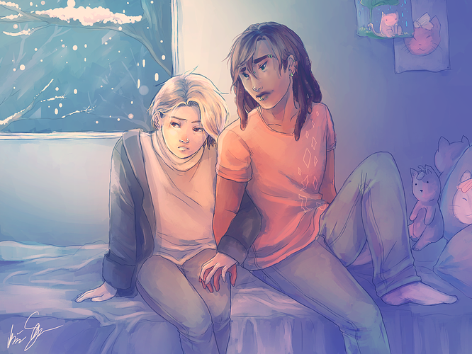
The composition and expression are nice 
The thing that sticks out to me as an area for improvement is the colors - particularly values. It needs more value contrast between lights and darks IMO (a good rule of thumb is that if you convert the image to grayscale, it should still look good). If you look closely at Araki's art, you'll notice that not all of his colors are bold - he still uses darker, mid-saturation colors for shadows to give the illustrations depth. It might yield some insight to download some images and use the color picker on them (not to copy, but to understand his choices of colors in more detail).