I read everything you have, but I'm only going to focus on the The Thief one-shot. I'm gonna mainly go through scene by scene for things that stuck out to me.
Setting a Scene
So the one-shot begins in a generic forest. We don't know the name of the forest or where it's oriented geographically. Now, that's not particularly a bad thing, but it doesn't help the reader understand what is going on. This scene would've been helped with an establishing shot showing the forest's relation to the village it sits beside and with the introduction of a landmark.
Take the swamp episode from Avatar: The last Airbender. The swamp that is the focal point of the episode is treacherous and confusing, but what makes the setting memorable, other than the characters, was the big spirit tree at the center of it. That tree gave the viewer something to refer back to if they were confused during the episode and it made the swamp stand out against other forests the viewer might have seen in other media.
I feel as though if you came in with an establishing shot to show where this is all taking place and a landmark, whether that be a big tree, rock formation, or another point of importance, the reader would have an easier time settling into world. You can even draw the reader in with sound effects of Era killing the bear then hard cut to her feeding the cub before moving on with the rest of the scene. Speaking of...
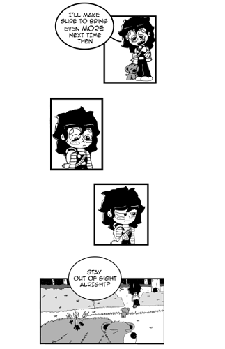
Personally I think a gradient from white to black behind the panels would've done well to add to the emotion of the scene and not made it look so sterile. The sizes of the panels could be larger too.
This is one of those things where you have to problem solve to get the best readability. Again, another establishing shot would've done well here. When I first read this scene, I though the person shouting at her, was coming from beside her, not behind her, so I was confused when she did a full 180. If when starting the scene, we saw Era from a profile view, I think it would've been more understandable where all the characters are standing in relation to one another.
General Artwork
I won't spend too long here because artists are usually aware of the things they need to work on. Perspective is a major thing that stood out to me. You can sometimes fudge the perspective of a scene by making the things in the background drawn in thinner lines than things in the foreground, but here, things just look very flat.
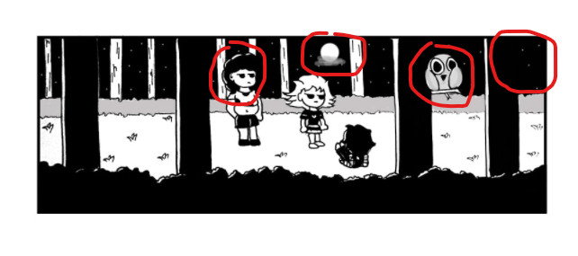
I commend you for doing a black and white comic; working without color can be more difficult because now you have to focus on the value structure of your characters and how they compete with the backgrounds. Which why the above panel is so unfortunate. I circled four points in this panel where a reader would have a hard time understanding the scene due to a problem with value and perspective.
1) Value
The trees in the foreground, the hair of the girl, and the night sky are all the same shade of black, the same value, meaning they all blend into one another. This disrupts the visual hierarchy of the scene and makes the scene harder to read. I'm assuming you're drawing the line art traditionally, scanning in, then coloring the scan digitally. Give yourself some room to mess with the values, you only have three so far: black, white, and very light grey. There's more than that available and be sure to use those value to set a scene. If something is going on at night, most every thing should be in darker values.
2) The Owl
Let's talk about that owl. Because the values surrounding the owl are all the same, it looks like there's a giant owl floating in space. I get that it's sitting on a branch in the foreground, but at first glance it does not look like that. The owl just seems too big for where it sits on the page. And this is another value thing, but the stark contrast between the light colored owl and the dark background (coupled with it's big, piercing eyes staring right at the reader) is enough to distract the reader from what's going on in the panel. Plus, the branch the owl sits on has a tangent with the bushes in the background, messing up the visual hierarchy and the perspective even more.
3) Perspective
The background confuses me. Later on you say the forest is dense. . . but it doesn't look dense at all. You can see the moon and stars (the first indication that this is night time since everything else is framed as though it's daytime and there are no establishing shots informing us of the time of day) through the trees. But at the assumed perspective would mean you could only see more trees and foliage through the tree trunks, but we don't get that. The moon and stars should be high above the canopy, but instead they're caught beneath the branches. There's not much I can say in terms of advice other than practice drawing things in perspective, learn about vanishing points and the like.
Personal Nitpicks (you can skip this if you want)
I don't understand the clothing choices and I can't tell what they are supposed to tell me about the characters. The clothing doesn't inform me about the setting, the village or the forest. I can infer their ages a little bit, but I'm likely wrong due to how the characters themselves are constructed with bigger heads and eyes, and smaller bodies. And they, well Vana and her friend, are able to fight, confusing me more about their ages. The clothing is juvenile for all parties so I though they were kids in the 8-10 range, and it looks like clothing straight out of the early 2000s. There's nothing wrong with not knowing the ages of characters when reading, I don't even mention them in my comic, but artwork is all about communication, and things are getting lost in translation for me. I really don't like to the eye shines, like the little half circle in each eye. I think I'd be less bothered if the eye shines were always part of the iris/pupil and not drawn in the corner of the sclera. And what was up with the random Korean lettering (I'm assuming it's Korean), very distracting.
Action
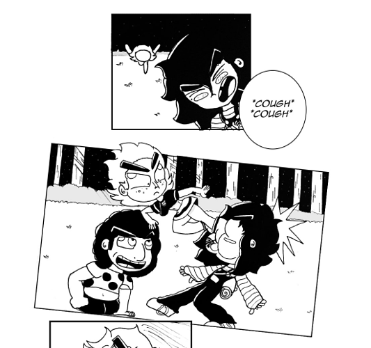
The action scene wasn't bad, just a little confusing. I liked how Vana broke out of the panel and the panels were tilted to flow with the action. Good stuff! The confusing part came with the orientation of the characters.
In the first panel, Vana is running up from
behind Era. We don't see her jump. Then all of a sudden she lands a kick on Era's face from the
front. It feels like as you were drawing the scene, you lost track of the characters and to make up for it, panels weren't included that would've further confused the reader. So careful when you write these scene. I recommend drawing an overhead view of the setting for yourself so you know where everyone is and how to orient them when they fight one another. Always refer back to previous panels so that you don't forget where everyone is.
And add more sound effects, add some energy to the fighting.
(wait she can take out a bear but not two girls?)
Whew! That was a lot. I can see the effort in this project and I commend you for that. I didn't really talk much about the story because it is a one shot that was more about establishing a point in a character's life than getting into a full story. All of my critiques were for the sake of making the comic more readable so be mindful of some of the things I've mentioned and good luck!