Alright then.
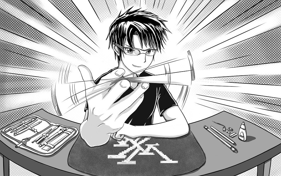
First of all, simplicity is your best ally here. The simplistic style lends itself very well to both story you wanna tell, and how you're telling it. Each character looks unique (especially the heads/faces), which is not always the case with some comics. However, I think the biggest problem thus far is the pacing mixed with the static frames. Take page five, for example. This is a funny joke but because of the way it's framed and built up, I'm just not laughing. I would have made the two panels of the basket ball hoop into two smaller panels at the bottom of the page, while dedicating the middle frame to a ridiculously dramatic shot, like this...

Or something like this...

(Sorry, the only good examples I could find on Google were not of basketball poses.  )
)
Anyway, I think that's the main thing holding your comic back, as of right now. Your simplistic style is really in your favour here, and if you just work on tweaking your punchlines, I think it'd help the comic a bunch. 