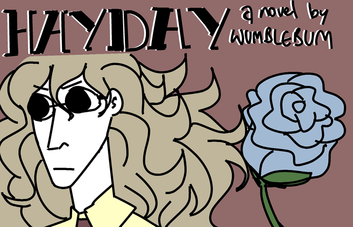
The hair looks really good!
For your banner, I would use a different color for the middle. Reading the words in orange is hard. You can also try making it bigger, but your color scheme should also be consistent. Have you tried using black for the "Background People?"
Haven't tried it yet, but I'll send you the product when it's okay.Thanks for the tips!
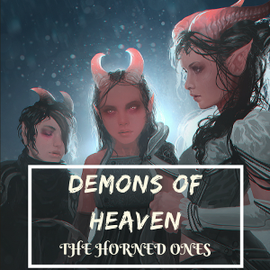
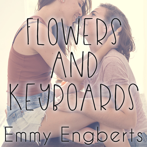
New book.Thumbnail:Banner:
I loved the font you used! Can you tell me what font it is?
"Factory" is in Playlist Script."Drugs, Violence, and Rediculousness." is in Permanent Marker.
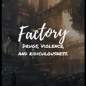
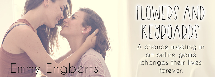
Another new book today.Thumbnail:Banner:
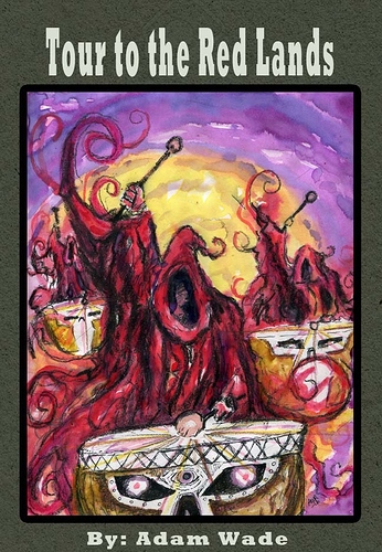
Just started this one. Would love any feedback!
Cover:
Story header:
I can't draw for the life of me, so I use photoshop and stockphoto websites
You're going to need a square image for the cover on Tapas, and the banner at the top needs to be much wider.
These are the numbers:Thumbnail (cover): 300x300 px (I make it at 800x800 and then resize to 300)Series banner (at the top of the pages): 1280x460 pxCustom ad banner (at the side of your chapters): 280x180 px
Thanks! I'm trying to get better at making graphics, so I want to practice with different fonts.
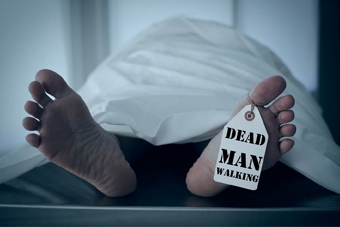
So far it seems fine, but I would try to make the title bigger. Or, if possible, try to focus the cover more on the foot since that's where the title is.
Here's the cover I was thinking of if I managed to get my stories publishes as a short story collection
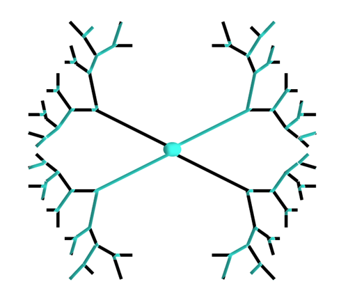
My cover is symbolic of how different paths meet at the middle, kind of like how my short stories will eventually be connected.
It ended up looking like a mask too, which I found pretty cool considering each story is told in someone else's eyes.
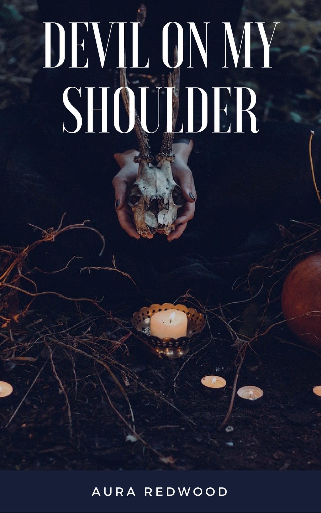
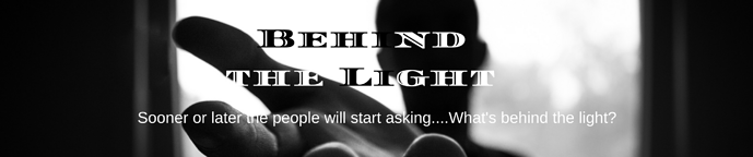
My story is Behind the Light, so I wanted my novel cover to be symbolic, something with contrasting light and dark. I know the first one is kind of hard to read, but I liked the contrasting colors of black and white.
Ooh, I can't help but notice that the text is a bit of a difficulty in these images and I have a tip that might help!I'd recommend making all the text black but giving it a white outline around it... Or the other way around depending on which you think looks better.I hope that helps! Not sure if you'll think it's a good idea or not but it's worth mentioning.
Thanks for the tip! I'll try it out.
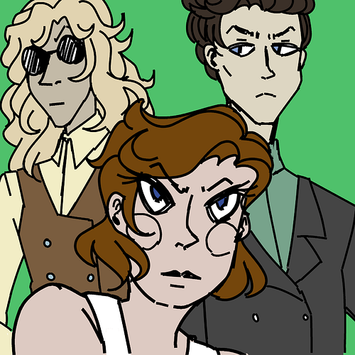
For my novel, Hayday, I'd be happy to show the thumbnail and the promo ad!
It's about boxing, sexism and the lgbt experience - during the 1920s.
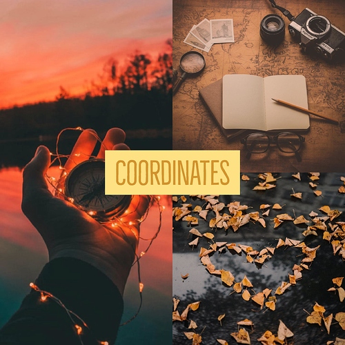
This is the cover for my Nano novel, Coordinates. ^^ I've got all 20 episodes posted here, using Tapas seriously is a first for me.