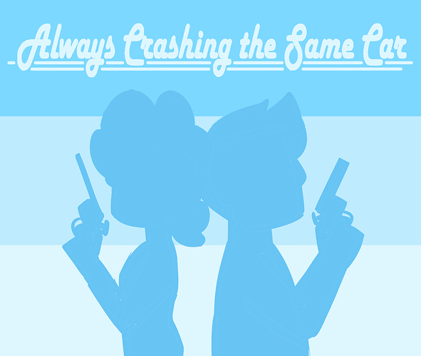
Ok, both fortunatelly and unfortunatelly for people surrounding me I am both: a graphic designer and an asshole... so as they say:

The small lettering text is just too small, even on the full blown up picture - it'll just won't be readabe... besides it doesn't contibute much to the information we're already know or can get aknowledged with in othe accesible ways. It also falls under substencial graphic design rule: "whatever is not neccessarry - is excessive". Following this rule - lower 25% of charactr silhouettes does nothing to contribute to the piece of story they tell and also goes against rather square format of the ficture in terms of composition. So, small text must go, silhouettes must be recomposed. Take it or leave, here's my rendition of the same picture, which, I believe, works much clearer and better.: