103 / 282
May 2020

Great update! Very much needed.
I can see all my series but one who is now reporting a 400 bad request error and cannot be shared on social media. I will wait for the end to update to see if the glitch disappears :smiley:

Just saw the rollout! Lots of good changes. Banners are baaaack, and a giant subscribe button (much appreciated) and I LOVE that infinite scrolling is included with full screen mode. Its a perfect function for binge reading, whether or not you have a scroll comic or a book format comic that updates one page at a time. Very nice.

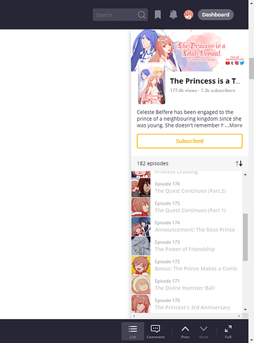
I'm bummed the navigation bar is still there though, and static now. I disliked it when it was animated too. I started adding bumper images to the end of my updates to fix that little distraction (since it would pop up when you're not even done with the page), but now its always there xD sigh. I just don't think they're necessary, especially with the episode list back on the side now and with infinite scrolling back. A lot of the buttons on the bottom bar would look fine on the side bar I think, the "likes" button, the button to switch from list to comments (that would make more sense placed there) and the social media sharing buttons. Anything to just to get that bottom bar out of there.
Either way, everyone will likely read in full screen mode, which is fine because that looks great. Otherwise, the regular layout feels a bit claustrophobic right now. There's just not much space for the actual comic page.

On the mobile web

The up and down arrows for reading next is good.
The custom ad banner is back.
When going to comments, you get to a comment section page and can go back to see the page that the comments belong to. This is good and something I miss in the app.

The subscribe button is still hidden under a popup menu under the 3 dots.

When going to a series it asks if I want to read from where I left. This is good.

Good work Team Tapas.

Something that just happened:

My s/o managed to like my upcoming page that is not yet released. So I think people can like the preview of the next page in a webcomic right now (at least on desktop)? :no_mouth:

Also. on my desktop in Crome browser the site is jumping every time I mouseover the right menu??

I saw this on the phone right before going to sleep and couldn't comment;; It's going to take a while to get used to and the bar at the bottom is strangely catching my eye a lot, but it's feels so much better than the previous update already!

Also, the alerts are now red, they're way easier to notice in the white background! And the arrow keys still work to switch episodes nicely, can't recall if that was in the previous update or was added now.

That's usually what "custom ad banner" is used for, if you're not linking to ko-fi.

Yes, this. The "See all" and "Add a comment" should be available on the episode itself, not just on the sidebar. We should also be able to see who has liked the episode and comments.

There are also some extra horizontal scroll bars coming up and a jitter when my mouse goes from being over the page to over the sidebar.

I'm surprised no one's brought this up yet, but I'm not sure how I feel about having the two scroll bars next to each other on the right on desktop.

Hovering over the chapter list makes the browser scrollbar disappear, and then hovering elsewhere changes it back (while also shifting everything). This is entirely just my opinion but it seems like a patchwork solution for chapter scrolling instead of a seamless interface. :thinking:

I noticed the same thing. I was about to post some screenshots too.

Overall, love the changes, just find the two scrollbars odd, especially since once one disappears it shifts the entire screen contents.

(For reference, I am on Firefox, Windows 10)