260 / 282
Jun 2020

I just checked your series on desktop on both Chrome and Safari - both times the series appear with oldest episode on the bottom, newest episodes on top. I'm brought to the first episodes because I haven't read your series yet.

Can you view your newest episode, close your comic and then return to see where it drops you off that time?

It worked that time when I clicked on the newest episode, closed, then reloaded. Not sure why it was messed up before. Probably something I did, I'm sure.

Every time I go to read a comic it takes me to the latest page instead of letting me pickup where I left off.Also I don't seem to be able to share comics on social media anymore, I can share pages but not the comic which is inconvenient. I've noticed a hard decline in ad impressions despite increased views however I'm not sure if it's related to the pandemic since despite still having impressions I don't see any ads on the site whether it's my work or reading the comics of others so I'm just confused.

@ratique newer mind the pre-load logo issue. It was a transparent background on the series images that made this

Edit: But you may ask them why the heavy loading of a series? It brakes the reading flow when you have to wait for each image to load. I do not see this at other comic hosting sites

Edit edit: And I do not record that there was a heavy loading before the update?
This is especially something that bothers me when reading big art series with black background like Queen of gods. All those white brakes are bad for the flow.
(And yes. I read that series many times)

Interesting! I didn't even think that was a thing. I updated the team on this, since it's still a problem if more creators use transparent backgrounds.

Regarding slow loading times, the team is reviewing why this is happening.
And thank you for re-reading the story!

Here you go

Hello!
I got back to see the changes are back like good old endless scrolling, banners and other stuffs which are very good :smile:

However, when scheduling or uploading the episodes now :

I am not able to see how the episodes will be viewed in desktop or mobile version (episode preview). It's it a temporary glitch?

Chrome as well but I'm not able to see them :worried:

It was fine before but it's acting up since last 2 episodes.

I'm currently facing issues to upload the next episode properly now.

Yeah I've heard some people have issues uploading a new episode sometimes, but it normally works after a few tries.

As for not being able to preview already scheduled episodes, does a message pop up? Does the page not load while the UI is unaffected? Is the page actually broken?

I don't know but when I'm trying to see the previews for the existing episodes or the new episodes it's showing blank white.

Without any titles or anything.
May be the page is broken as you suggested.

It is a major step forward from the previous update. Thank you for listening to the huge wave of user feedback you received.

These are the suggestions I have as an ex(? now independent, I guess) web developer:

  • Make it so that the top and bottom bars on Tapas are smaller. Right now they're enormous and take up an insane amount of screen space and detract from the reading experience. Frankly I don't even see why the bottom bar is necessary at all, and the top bar is 2.5-3x as large as it needs to be. It makes comics very hard to read, even on a 1080p screen and even in fullscreen mode. The bottom bar should disappear while scrolling down at the very least; it is a distraction and a visual blockage.

  • Having the episode list on the left would be preferable to having it on the right. Most comics are read left to right, so having the list in a position where your eyes are consistently shifting forward to is distracting. Maybe make this able to be toggled, as users who read more right to left comics may have a different preference. (There is a reason, visually, though, why most navigation menus are on the left-hand side)

  • Since you are scrolling down, it makes sense to have the episodes in the navigation menu increase going down rather than going up. As is I can't tell how many episodes I have to read because they are going in the opposite direction than I am scrolling.

  • The like button should ALWAYS be clickable while scrolling through episodes and should be placed with the episode description at the end. It should not be off at the bottom on a separate bar, as this breaks the reading experience and heavily discourages users who are catching up on comics to like the episodes.

  • Likewise, comments deserve more visibility than only the top or one two being shown (and with no threads). A big part of Tapas is community, and by giving visibility to only a select few and minimizing the comment section to a point that it's so easily missed is going to take that away (especially on smaller comics with less viewers). The sidebar is also far too small to play this role and has no business being a comment box, so please move comments back onto the main scroll area.

I still don't quite understand why Tapas made the move to make 99% of their site a Webtoon clone and overhaul the site only to have to bring features back (in a far less than ideal way). It would still make far more sense from a user and usability standpoint to simply revert Tapas to its old design from before the update earlier this year. It's just a thought, but honestly I still can't see what this new design has brought except for headaches for everyone and an annoying series description page. That being said, finally seeing some glimpse of what made Tapas' desktop site worthwhile is nice. It'll be a whole lot nicer when a whole lot more keeps getting done to it though.

Possible bug (sorry if already mentioned).

The Ascending/Descending Order doesn't work. While visiting a comic without being logged in takes you to the very first episode. This is not ideal for comic strips with many many many episodes.

"New readers will start from your most recent episode." Just reverses the order of the episodes at the moment.

On PC: while reading, if I click to Comment, it opens up a bar on the right that I can't close later? So it keeps distracting me as I endlessly scroll down through the novel/comic and the comments change and might spoil things I'm reading. :sob:

AH -HAAAA! I have to click that little icon of three horizontal bars to make it poof away :smiley:

Where can we suggest features for the site? I'd love if we could reorder our episodes. I've just written a new first chapter but I can't see a way to add it to the front as a new episode. If I copy and paste it into the first episode the comments won't be relevant anymore.

Thank you but unfortunately, it is enabled.

(For another series, not the one my account is linked to)

All it does is reverse the order of the list instead of starting you on the most recent episode. Maybe that's the way the behaviour is supposed to be but it's not helpful in anyway way with a lot of episodes. New readers (or anyone who comes across it as a link) would have to scroll for awhile to reach the newest episode.

Again, not ideal for Comic strips.

@ratique

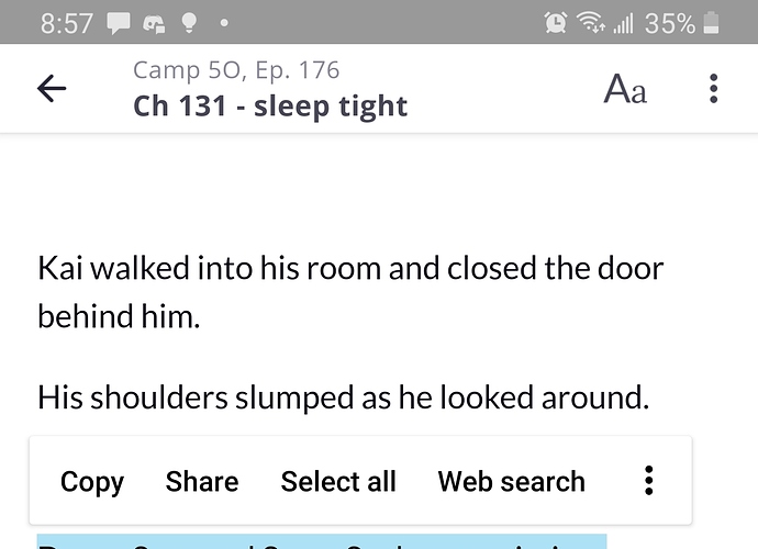
Hello! I know some updates were made to the app as well as the site (for android at least) and I recently realized that with this new update readers can now copy and past from the story! Im not sure if that's been mentioned or not yet!

This wasn't allowed before (I remember because I would always need to keep scrolling back and forth when quoting something from the story in a comment) and just wanted to let yall know in case you werent aware! I attached a photo of me doing it with my story but I can select any text from any story!

Also, two more things about the tapas app update (not as big a deal as the copy paste thing but something I also feel is worth mentioning)

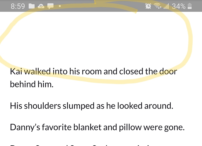
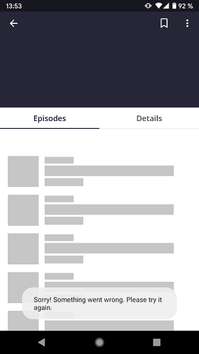
Now theres always this huge chunk of blank space at the top of every chapter, and it's not a big deal but it just kinda looks weird :confused:

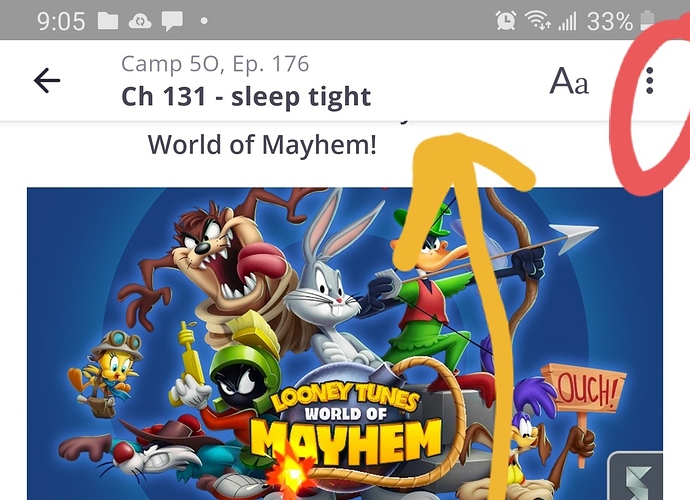
And before the update I feel like a reader would be able to click on the creators profile pic or name at the bottom of the chapter and it used to take you to the creators page and show you their other work, but now pressing it just toggles the top and bottom bar. This was usually how I would go the creators page and check out their other works, and it's a habit to press it when reading stories and comics. It took me a second to realize that now the only way to do that was to press the three buttons on top and then click the go to creator button. Again, not that big of a deal, but it does feel a bit more cumbersome and it might make readers not go through the extra steps.

So, last two arent that urgent, about 90% of my reader base have let me know they use the mobile app to read, so that's why I'm just being hyper aware of what its like to use the app and nitpicking it from the stance of a reader. The first one I feel like might be a security thing and in the past copy and pasting want an option and while it does make quoting a line from the story easier, I think most writers might appreciate that getting looked into!

My phone is a samsung galaxy s9, android version 10 (amd I'm still not sure what the software version is :sweat_smile: but I sent that screenshot of my phone details in the topic about the italics appearing big on the app!)

It's also still set up that if you start reading a comic, but only read like 10 episodes. So you bookmark it so you can read it later. If that series updates before you start reading again, clicking on it in your dashboard drop down takes you to the newest release instead of where you left off :x:

Do you know if the team is looking into improving the general search feature? I was just looking at BL or Fantasy comics yesterday and after scrolling for a bit, the list just.. stopped. I'm sure there's more BL comics than like 100 or 200 on this site. Specifically in the Fresh section. Since there doesn't seem to be another way to just freely browse (free to read/fresh) without it inevitably ending.

20 days later

@ratique Hello Tapas Team!! Thanks for your tireless update efforts, especially recently!
There are a few features I'd really like to see as a reader and have heard people talking about so I thought I'd mention them here as a wishlist:

  1. Filtered Search: I use it SO much to discover new series on other sites, and I'm really missing using it on Tapas. It adds so much visibility to smaller series! For reference, I mean something like @violin's http://tapasfans.com/4 (with genres/tags etc) but directly on the Tapas site.

  2. I noticed the mobile site and website have Genre Trending as a list option, but Trending isn't there on the app, only Popular/Fresh/Binge/Wait for Free are. I'd love to see Trending there too since it's the fastest moving list, so it adds a lot of visibility for everyone.

  3. This is more of maybe a bug fix? The front page trending lists are very frequently the same few titles, which usually have completed status, and I've noticed that this list mirrors Trending > All Genres>Free to Read. For some reason, Trending>All Genres>All is easier to climb when Premium titles are included? As in a title will be ranked higher when competing against just free titles than it will when premium titles are included. It seems counter-intuitive.

  4. This one is definitely a bug, but for the last 2 weeks or so, I can't comment on a chapter when using the mobile site. Only the app works.

  5. Someone just reminded me of this one so I'm adding it! We'd love sorting for our reading/subbed to lists

Thanks for taking the time to look at my list! Keep up the good work :smiley:
Jay

Awesome thank you for the feedback! Very helpful.

I'll make some reports to the dev team and see what they say!

Regarding 1., the team is currently working on an improved search system, although a way to filter is currently not planned as far as I'm aware. (More traffic for violin!! ;D). Let's wait for the updates as they may improve the search enough to make filters not as necessary anymore.

Regarding 4., that's definitely a bug and the team is aware and is working on fixing it. The apps work fine, so use those for now when on mobile until that issue is fixed.

I want to ask, if mobile app will support other mobile OS, like Ubuntu Touch, /e/, LineageOS, Sailfish OS, or new HarmonyOS (Huawei). I would like to have same functionalities with other devices...

btw. idea about desktop app?

Is there any chance that the devs can implement manual chapter bookmarking of some sort? The site royalroad.com does it like this: The most recent chapter you have read is your auto-bookmark, but if you click an older chapter the option pops up to set your bookmark to there instead. That would save a lot of headaches for readers I think when it comes to keeping up with the last-read chapter. I know it's been quite hard for me to keep up with all the stories I follow sometimes due to accidentally clicking on the newest chapter of the story and losing my place.

Just found this. And I found that it is so cool
Recommendantion for you
It makes so much sense to have the different feeding options, and not just trending.
Thank you.

Question is, can this feed also be shown when you have scrolled all the way down on a series last episode? That will give the reader some options when there is no more to read.

May

I LOVE the changes to the site.

Will there be changes to the creator's profile page in the future?. It is difficult to access creators' social media on that sidebar when the creator has a long bio. I zoom out my browser in order to read the full bio and access links. In the sample below I am zoomed out at 80% and still can't access all the links. There used to be a scroll bar, what happened to it?

Is that something you all might be looking into next?

One day I do hope to be able to place images in my novel, I have my chapter/arc covers waiting eagerly... XD

Newer tried to make a novel. But I see many of them with images.
This one has many.

It is a nice feature that readers gets recommendations.
But is there a way to control that? Because some series is better than others to be listed

I would like to set an options on witch series to be in the spotlight more than others

2 months later

I'm not sure if you're still taking feedback in this thread (or where else to submit it), but: I would like to request that something similar to how Webtoons handles the header be implemented. That is: as you read or click on the comic, the header/footer will retract until the end of the episode or you bring it back by moving your cursor to the top or bottom of the webpage.

As it stands, I feel that the large black bars simply take up far too much space when reading on Tapas. I know fullscreen is an option but it takes away the browser menu too, and that becomes inconvenient as I'll usually check other stuff or put on different songs as I read too. A middle-ground between the two would be beneficial in my opinion.

Are there any plans for this in the near future? To clarify, I mean the two bars at the top and bottom of a comic episode. The one with the search bar and comic/novel sections, and the bottom one with the list and like button and everything else.

Hey I was thinking about it and something I would love to see implemented, and there may be a reason it is not done this way, but a "completed/read" section would be really useful.

A lot of times, when someone subscribes to a series, once they have finished reading the comic or novel (and it is completed already) they unsubscribe. This can negatively impact the writer/ artists. I think that a great idea would be to ad a "completed" or "read" section to the subscriptions as a sub category.
It could even go as far as to have a "To be Read" "Currently Reading" and "Completed/Read" Section to better organize the reader's "library".

It would not only help out the reader, but also the author.