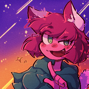
Is the thumbnail image fanart or something? It's a lovely image, but maybe not ideal as the thumbnail for links, because it's not consistent with the art in the comic itself. Maybe you could showcase fanart or guest art between chapters? I've found readers enjoy that.
The cover is a cute design, but maybe a bit low-contrast (especially the text) for how small covers are displayed on Tapas, and maybe doesn't sell the concept of "magical cat girl" so I'd maybe recommend making a few edits there?
The comic itself seems cute, but the way the colouring style seems to change every page is a little distracting and gives a bit of an unpolished, "first comic" sort of impression. It's not a bad comic, but it feels like you were still finding your feet and experimenting to find your style when making this, and shouldn't be hard on yourself for not hitting targets with it, but more focusing on learning and developing in preparation for a future comic or reboot. There are even points where in the comments you've noted areas for improvement in the storytelling and stuff.