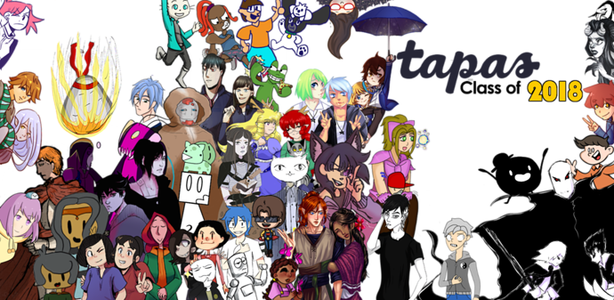
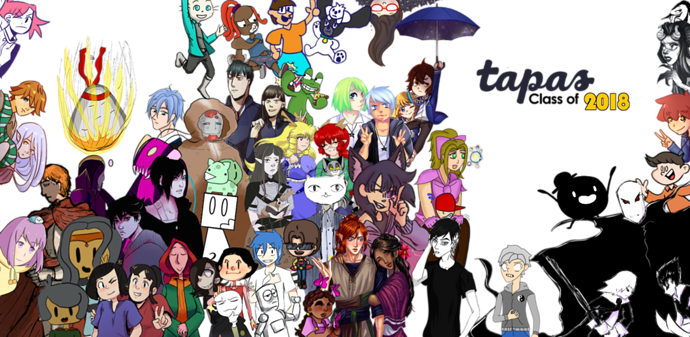
Heya @ghostieblu, I'm really not trying to be rude, but I don't see what's wrong with the one I posted. I tried to keep the image balanced and make sure when I moved people's OCs, they weren't covered/covering someone else too much. I also arranged the text in a visually pleasing way. In your version, there are a few characters that have been covered, or gaps that are even more unappealing. There are pixelization issues, and I already mentioned the resolution before. 
That doesn't make any sense. We should use the one that looks the best, not the first one posted. For the good of the rest of the group, I think we should just go with the one I made. I'm sorry if I hurt your pride by making a new version, but I really wanted it to look as good as it possibly can.