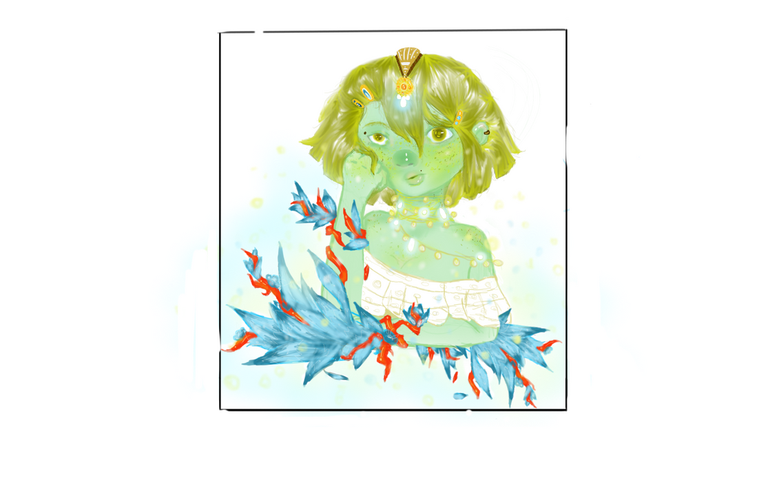
Since I'm now officially done with the 1st chapter of Ray Thunder, I've trying to experiment with my coloring style. I somewhat like the way I've been coloring, but I've been MASSIVELY violating the "shadow/light" rule(using black for shadows & white for light- no matter the scene). Ive been wanting/trying to sit down & learn more about colors/light & shadow, so Ive been keeping certain tips in mind that I've come across in the past.
I experimented with this pic using blue as the shadows(on a multiply layer) and orange as the light(on a lighter color layer); unfortunately, the orange light didnt look right on the jeans area so I removed it. Am I heading in the right direction? Does it look better/more vibrant than the original(though the light is coming from diff directions in each pic)? Just trying to find a starting point in which to moving towards making my color work stronger.
The original:

The experiment: