The comic you posted is superb. Mad respect for the artist. It's insane how such talent doesn't get recognized more!
I will adapt some of the things mentionned by all of you. I had the same impression, that it was too small to read (especially for people with bad eyes).
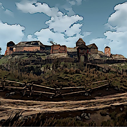
For the post processing, I can rework the pictures with techniques I used in later episodes to see if it looks better. The speech bubble problem is not that easy to solve, it is because of the nature of the "not painted" colors. It always looks like it is pasted onto. I guess I won't find a solution for that.
The lighting problem doesn't bother me that much. I like most of the look I created with it, but I know what you mean. The crushed black is something I created because I like that look. It's one of the tools I used to try to make it look more like comic art and not like a video game screenshot.
Tomorrow I'll change some of the things and you may check back, if you want to.
Thanks for all the feedback.