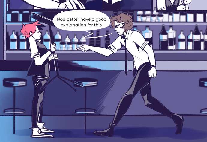
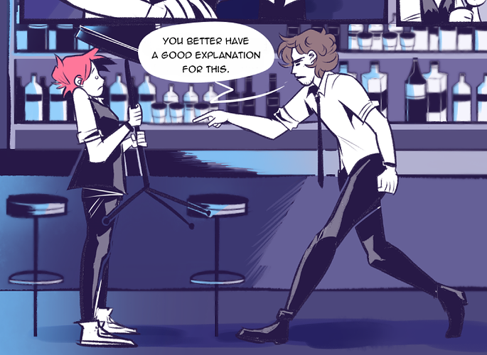
I am not good with fonts but I think the second one fits better also 
I also tend to think all caps looks aggressive when I compare it side-by-side to mixed caps, but then I remember that all caps is incredibly common for comics, so I don't worry about it.
I've heard it said that mixed caps can make text more readable since the words end up with more unique shapes due to the mix of tall, short, and tailed letters. But I think that's only really a factor if readability is a problem in the first place, which it isn't in Leftovers.